Onyx Boox Go 10.3 review: a versatile alternative to the reMarkable 2
Onyx Boox Go 10.3 Monochrome: one-minute review
Onyx has been aggressively pushing out new ereaders and e-paper writing tablets for a while now – the brand released the unique and compact Onyx Boox Palma and the Boox Note Air 3 series in quick succession, then followed it up with a new series called Go. This includes the Onyx Boox Go Color 7 ereader and the Boox Go 10.3 writing tablet that launched together, and a smaller Go 6 ereader that came later. It’s nice to have choices but, at the speed that it’s churning out new models, is Onyx making great products to keep up with the competition?
With the Boox Go 10.3, the Chinese brand has done better than what it did with the Go Color 7, which had too many software flaws when I tested it. The Go 10.3, on the other hand, is a far better device that looks remarkably like the reMarkable 2.
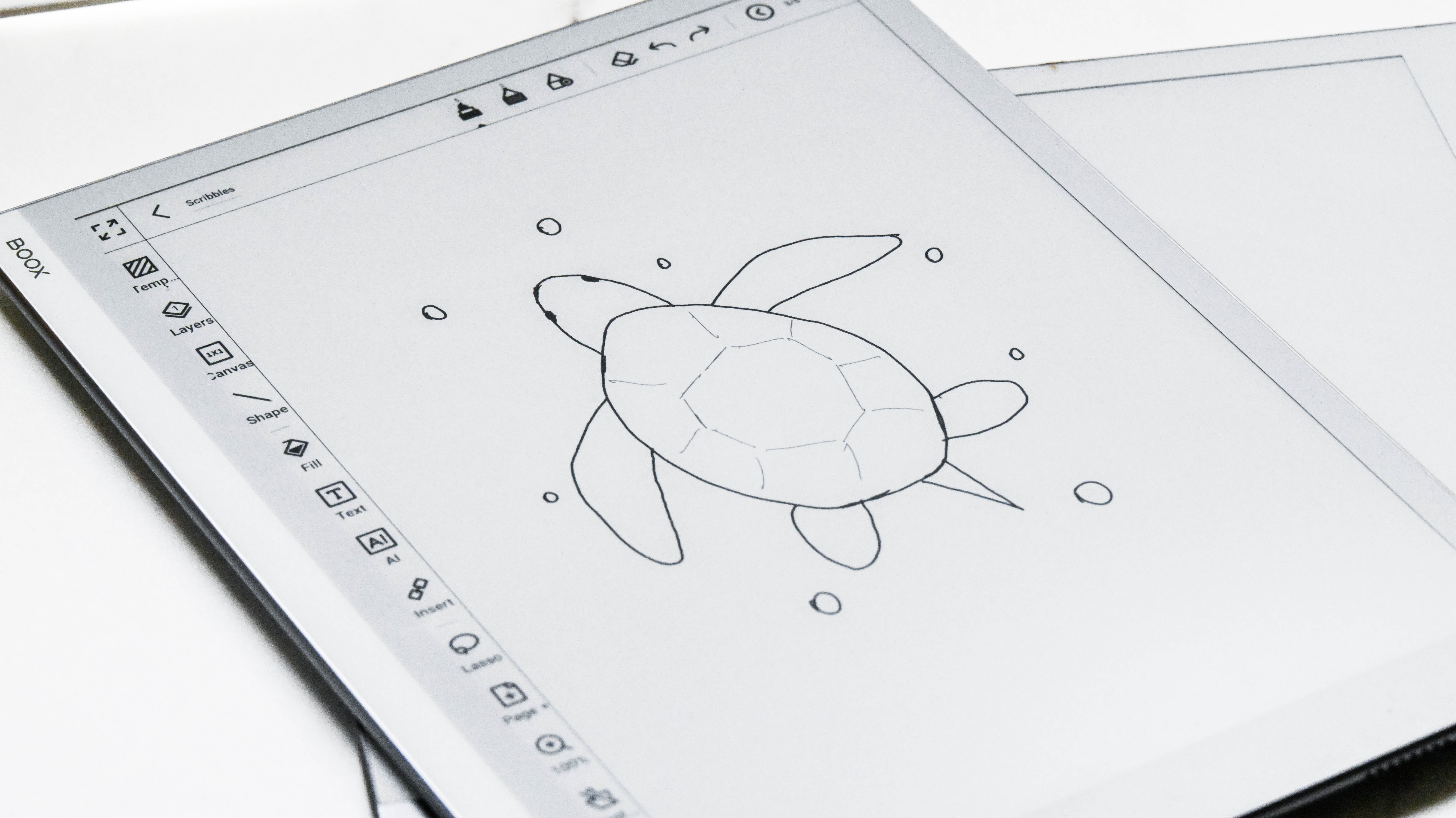
As the name suggests, it’s a 10.3-inch dedicated e-paper writing tablet and, like its Scandinavian counterpart, writes like a dream. Stylus input is fantastic with no lag whatsoever. With different pen and brush choices, plus different nib thicknesses, it will easily work as a digital sketch pad too.
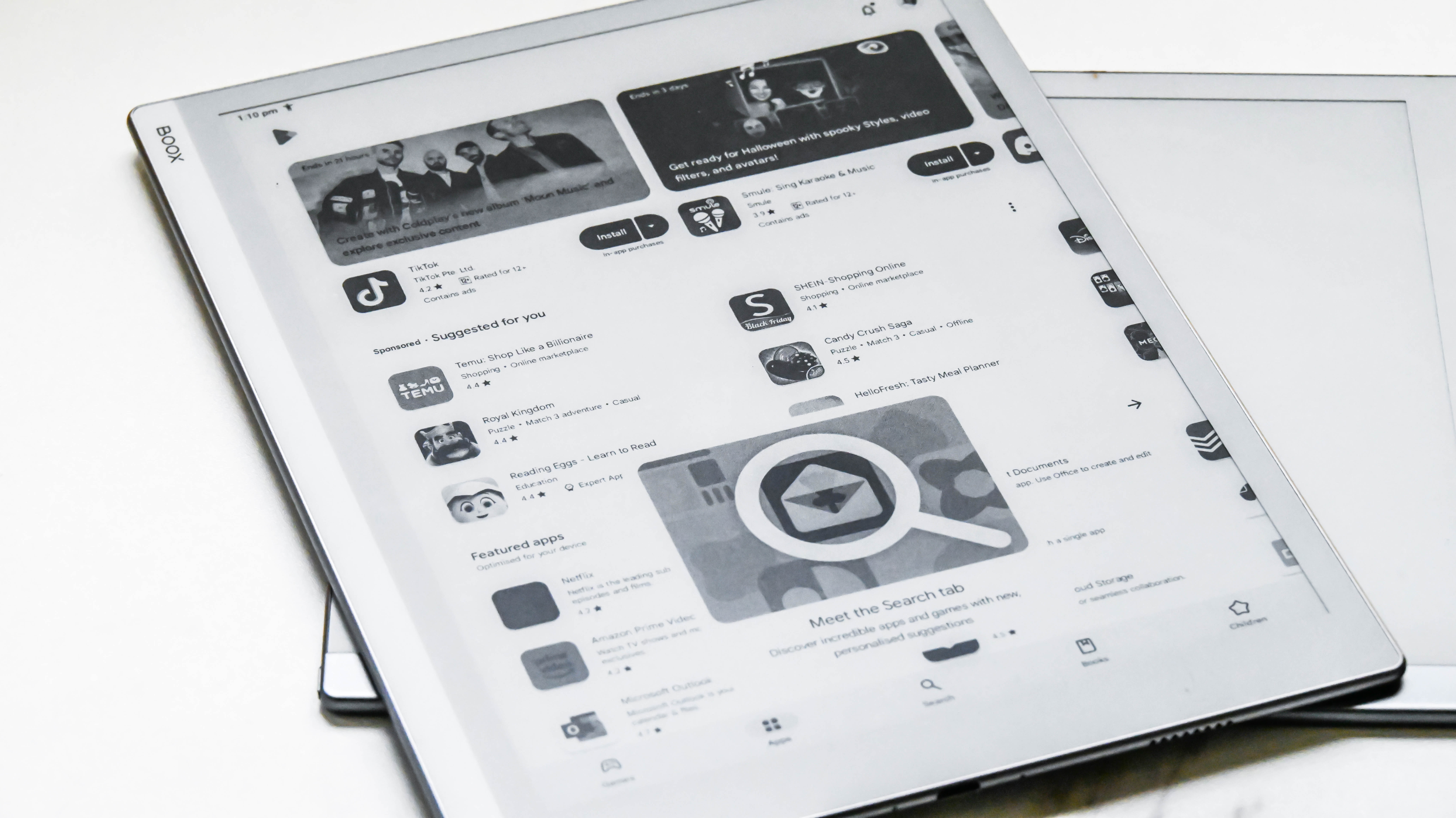
While the reMarkable 2 was designed to remove distractions from the creative process, the Go 10.3 isn’t so discerning – you get full access to the Google Play Store on account of it running on a trimmed-down version of Android 12, plus there are a lot more features in the note-taking application than on a reMarkable. It’s important to note that not all third-party apps will allow stylus input, so you’ll need to decide which ones will be the most useful to you.
It can also double up as an ereader thanks to the baked-in library app (NeoReader), something the reMarkable doesn’t quite master. However, lacking a screen light – just like the reMarkable – you’re not going to be able to use it for nighttime reading.
What I find most impressive here is that Onyx has trimmed its user interface down to make it a lot – and I do mean A LOT – more streamlined than on its previous e-ink tablets, but it still requires a slight learning curve. If you’re willing to put that time in, it could well be the better e-paper writing tablet for you, especially since the price difference between it and the reMarkable 2 isn’t all that different.
Onyx Boox Go 10.3 review: price & availability
- List price: $379.99 / €419.99 (about £355) / AU$699
- Ships with a stylus and magnetic sleep case from the Boox Shop
- Available to buy directly from the Boox Shop or third-party retailers
Launched in June 2024, the Boox Go 10.3 e-paper tablet carries a list price of $379.99 / €419.99 (about £355) / AU$699. When purchased directly from the Boox Shop, this price includes the stylus and a beige magnetic sleep case, but the latter may not be available as part of the bundle in some markets when bought from third-party resellers.
Given the reMarkable 2 has a similar price tag, now available for $379 / £389 / AU$639 bundled with the base Marker – which is a small drop since the reMarkable Paper Pro was launched – the Boox is quite well priced. In fact, it’s cheaper than the company’s own Onyx Boox Note Air 3, which retails for $479 / €549.99 (around £445) / AU$749 at full price.
However, without a screen light, it’s a little hard to recommend over other writing e-paper tablets like the Kobo Elipsa 2E ($399 / £350 / AU$629) and the Amazon Kindle Scribe (starting price of $339 / £339 / AU$549). If you want something far more portable than the 10-inch tablets, the Kobo Libra Colour will set you back $219.99 / £219.99 / AU$359.95 plus an additional $69.99 / £69.95 / AU$119.95 for the Kobo Stylus 2 purchased separately – that's good bang for buck considering you get a good color display and the full suite of Kobo writing features.
• Value score: 3.5 / 5
Onyx Boox Go 10.3 review: specs
Onyx Boox Go 10.3 review: Design & display
- Beautiful, slimline design in white and grey
- 10.3-inch E Ink Carta 1200 screen with no frontlighting
- Built-in speakers and mic
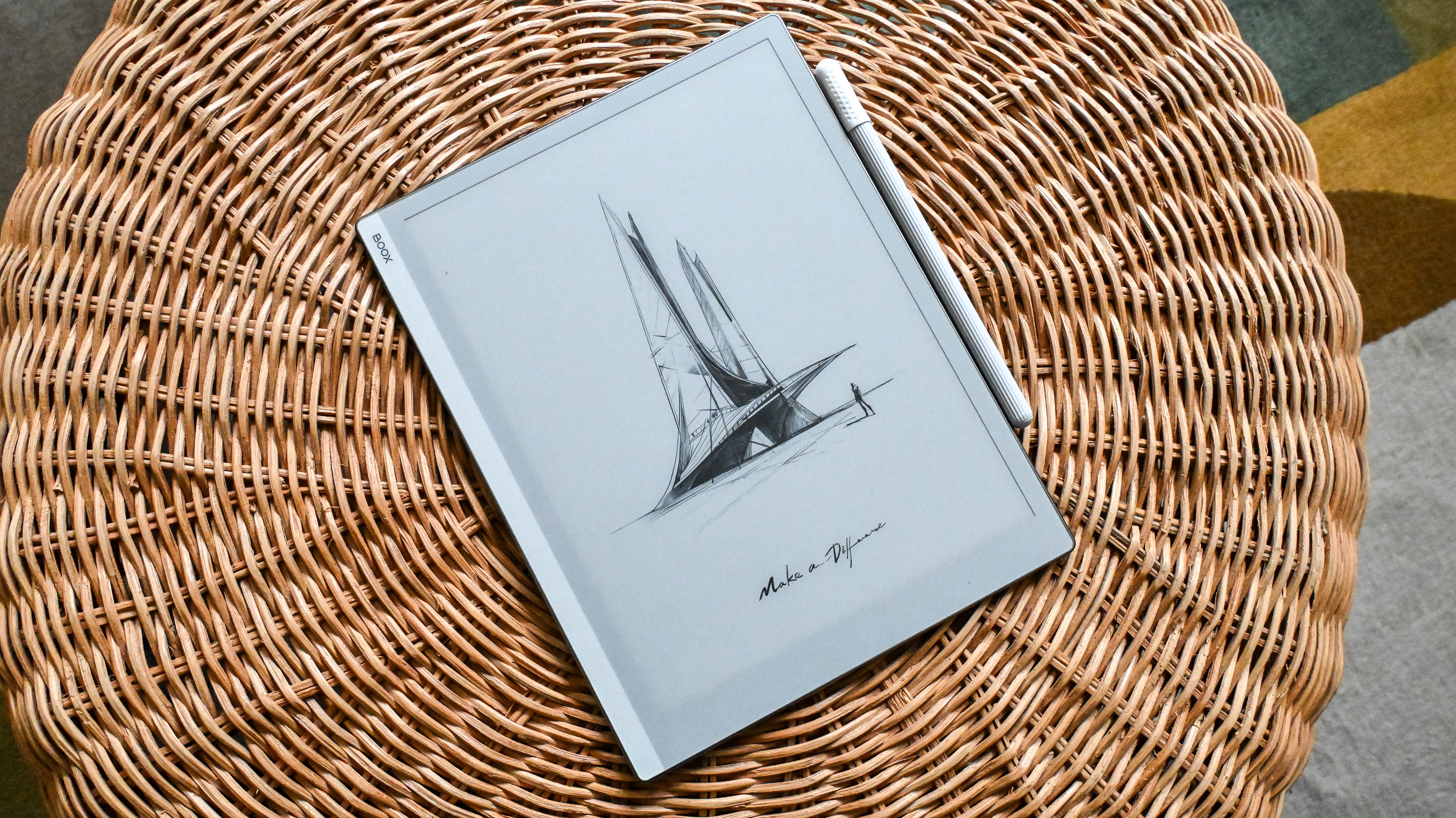
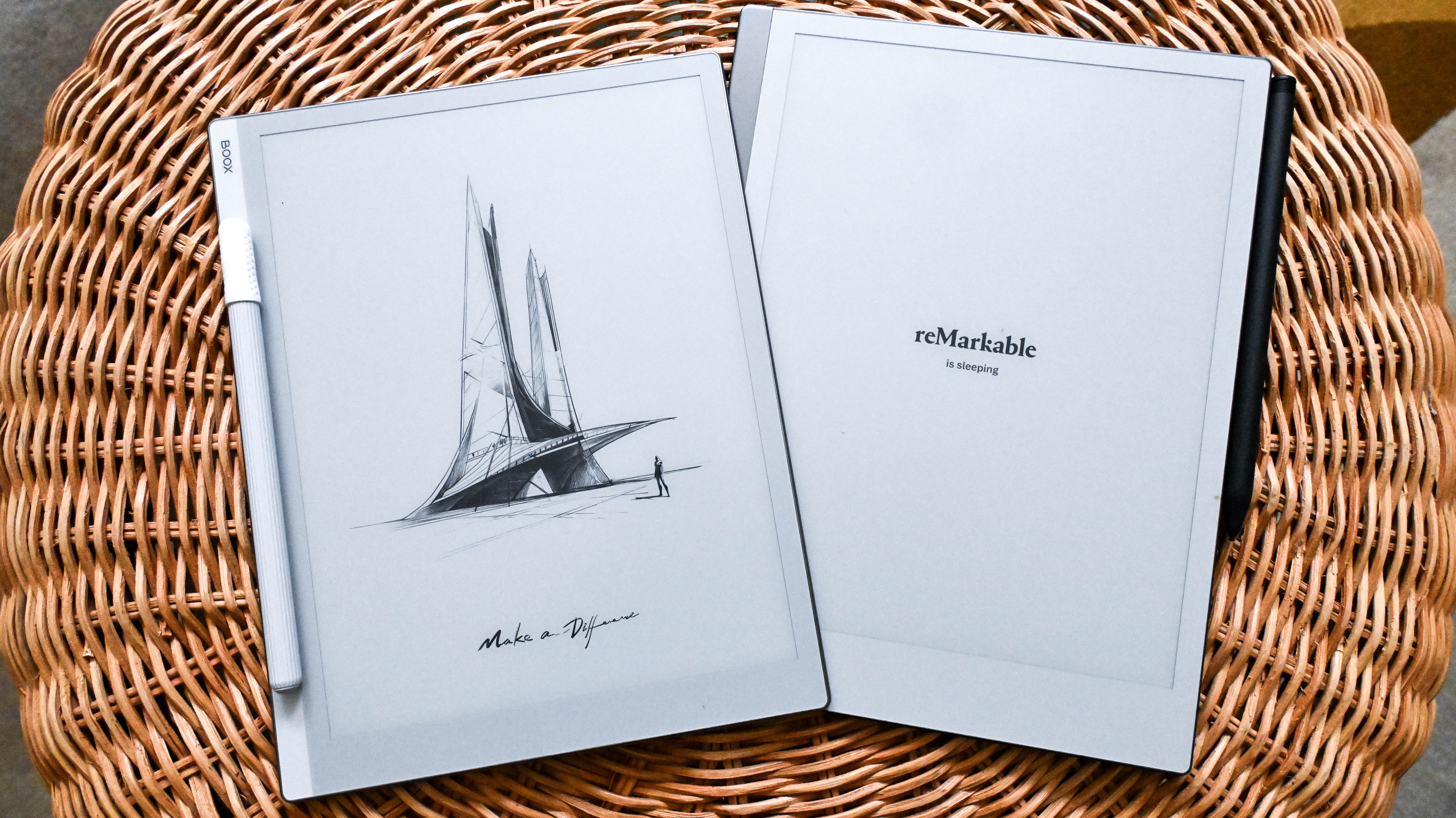
The Boox Go 10.3 takes a lot of its design cues from the reMarkable 2 but there are some differences that make the Onyx tablet smaller, lighter and potentially more durable. For starters, the Go 10.3 has a textured rear panel that feels very much like faux leather but is plastic. It offers a lot more grip than the glass on reMarkable 2, and makes the Boox lighter in comparison. This also means that the Go 10.3 doesn’t need the little nubs that the reMarkable uses as feet to protect its rear panel.
The aluminum edges of the Go 10.3 are rounded, leading to slim bezels that sit flush with the glass screen. The lower bezel, which is broader on both the Boox and the reMarkable, is comparatively smaller on the Go 10.3, making it the slightly shorter tablet and potentially shaves off a tiny weight too. The flip side to that is the Go 10.3 is more prone to accidental screen touches as compared to the reMarkable 2. Personally, I prefer the bezels on the reMarkable 2, with the metallic finish and white borders – epitomizing Scandinavian minimalism – compared to the light grey on the Boox.
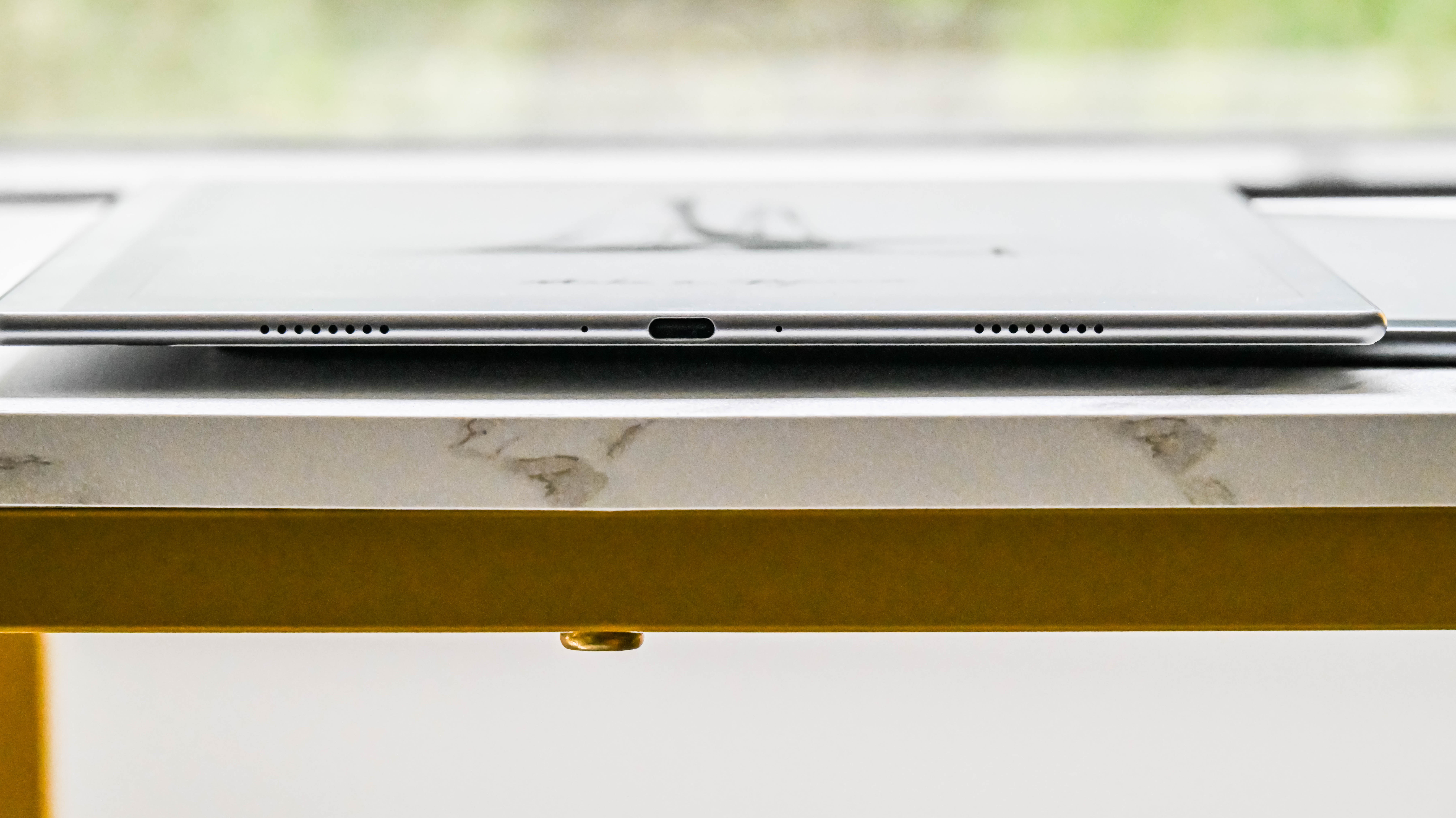
Keeping the rest of the design looking sleek, the Go 10.3’s power button, placed on the top right edge (compared to the top left on the reMarkable), sticks out only marginally, so you can find it by feel. The bottom edge houses the USB-C port in the middle, with speaker and mic grills on either side of it.
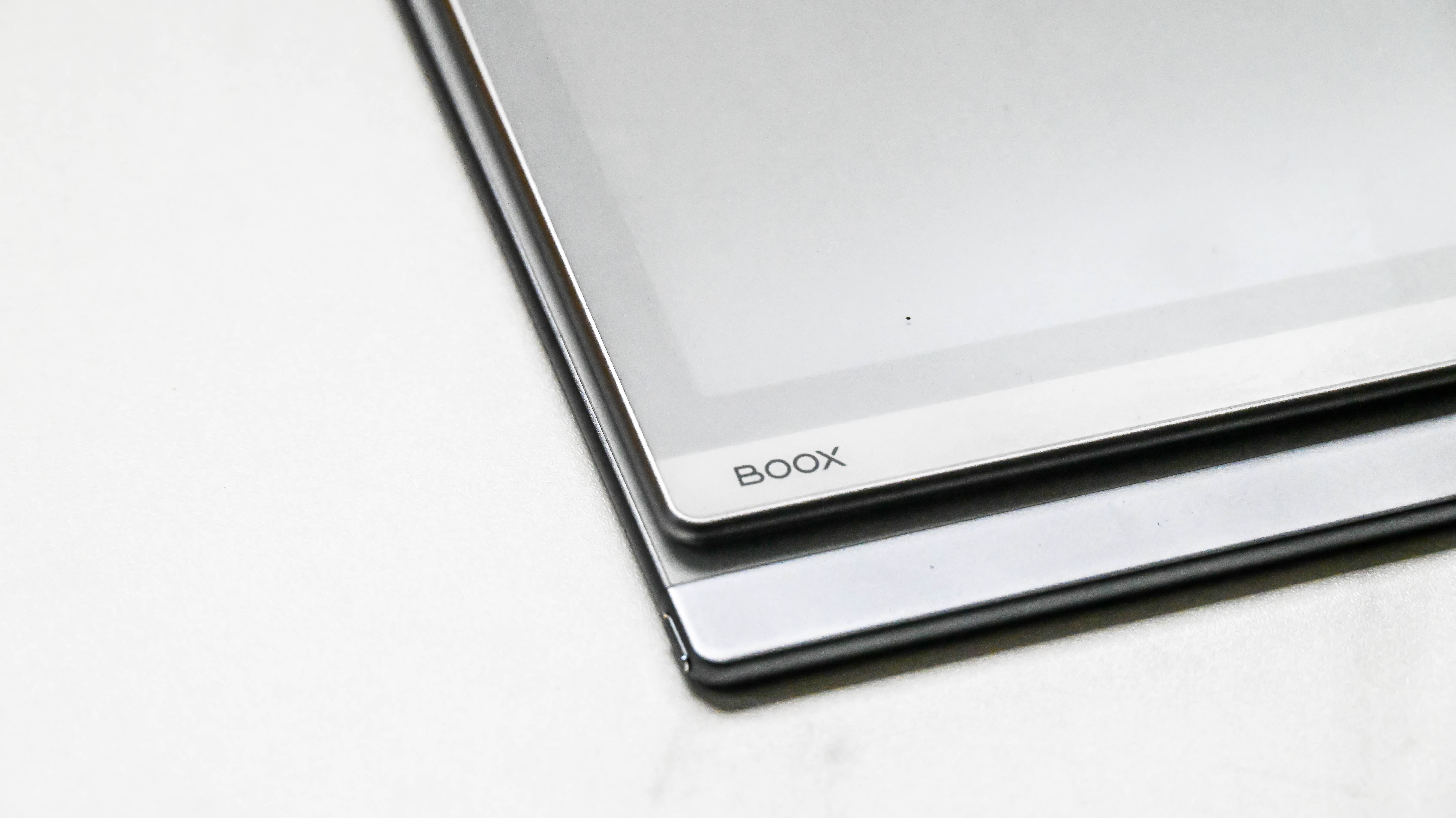
The Go 10.3 is now arguably the thinnest writing tablet in this class – its thickness is only just enough to enclose the aforementioned USB-C port – measuring just 4.6mm. That’s just a millimeter less than the reMarkable 2 which, until now, has held the title of the thinnest e-paper writing tablet. The Go 10.3 tips the scales at a mere 375g, which is lighter than the reMarkable 2 (403.5g) and the 2022 Amazon Kindle Scribe (433g). Despite that, it doesn’t feel fragile in the hand.
As the name suggests, the Boox boasts a 10.3-inch display, which uses the E Ink Carta 1200 screen technology. That’s now a generation behind with the Carta 1300 already in use in the Kobo Clara BW and Amazon adopting it in its 2024 range of Kindles. Where the Go 10.3 one-ups the reMarkable 2 is in screen resolution and overall contrast – you get a 300ppi display here (compared to 226ppi), while a side-by-side comparison shows that the blacks are blacker on the Boox. This makes text appear sharper on the Go 10.3 as compared to its competition, although the contrast on the Kobo Elipsa 2E (which also has a 227ppi screen resolution) is much better than the Go 10.3, which makes the latter a superior ereader.
That said, the reMarkable’s screen has a better anti-glare coating than the Boox – during my testing I frequently had issues with overhead lights creating bright spots on the Go 10.3, which made reading at certain angles quite difficult.
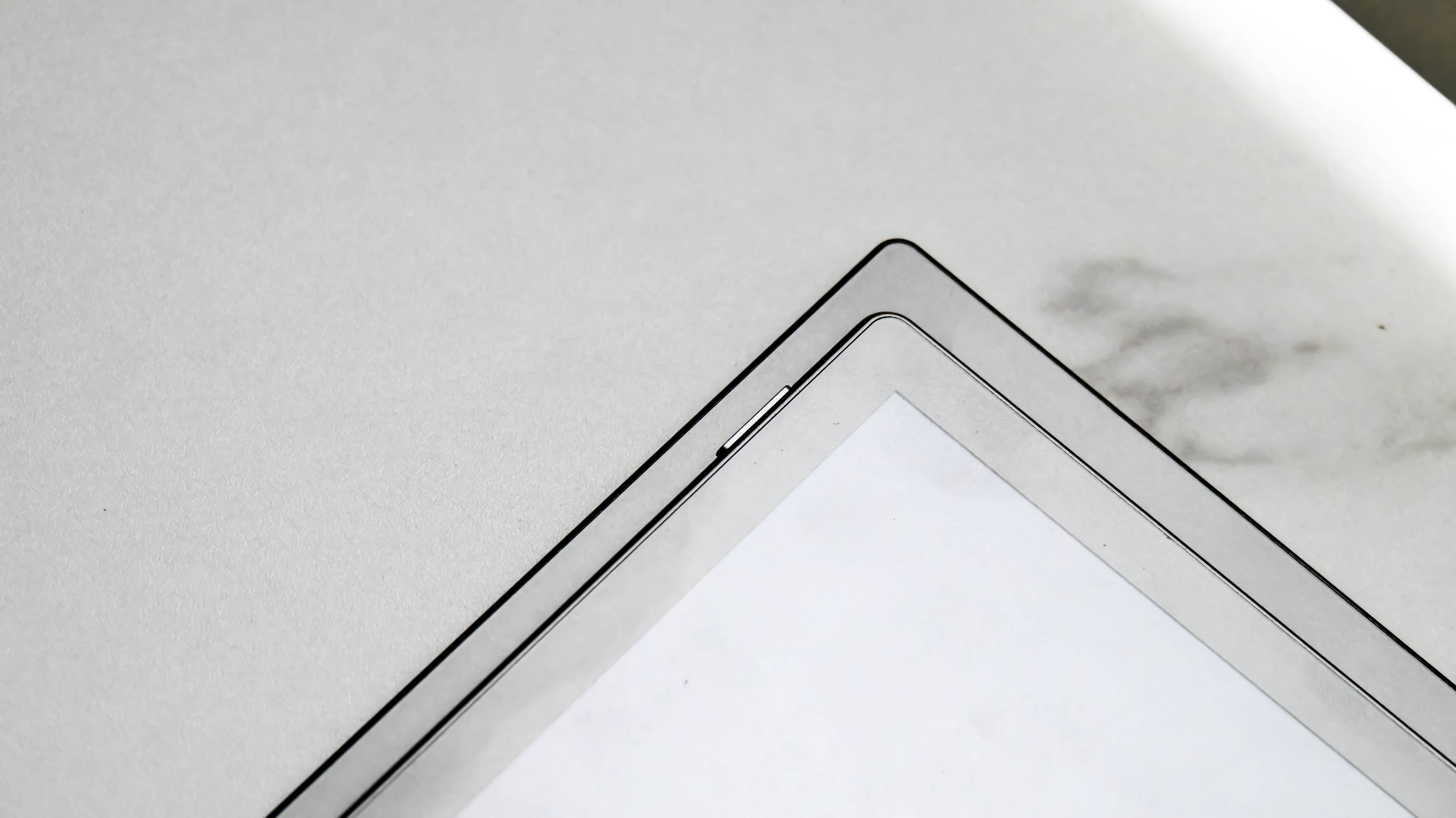
Thanks to the glass layer on the screen, writing on the Go 10.3 is a pleasure. I’d say it comes close to the reMarkable 2 and the Kindle Scribe – which are my favourite e-paper tablets to write on – with the Boox coming in a very close third. It ships with a stylus, which is a basic pen that doesn’t have the eraser functionality – for such a premium tablet, I think that’s a glaring omission.
If you’re buying the tablet directly from Onyx, you’ll also get a magnetic sleepcover for the Go 10.3. It’s a lovely-looking beige faux-leather folio, with a fold on the rear panel to convert it into a stand. However, the flap that keeps the folio closed is a separate piece that attaches magnetically and is easily dislodged when taking the tablet in and out of the bag. In fact, if you fold the cover back completely, the flap magnetically sticks to the front panel and comes away with it when you close the folio. It’s a small thing but I found it so annoying that I stopped using it after a couple of days into my testing.
Unfortunately you’re likely to lose the stylus without the folio case. While the right edge of the Go 10.3 is magnetic to secure the stylus, it’s too darn weak to be of any use. The curved edge doesn’t help either, reducing the amount of surface area the pen gets to secure itself to.
• Design & display score: 4 / 5
Onyx Boox Go 10.3 review: Software & user interface
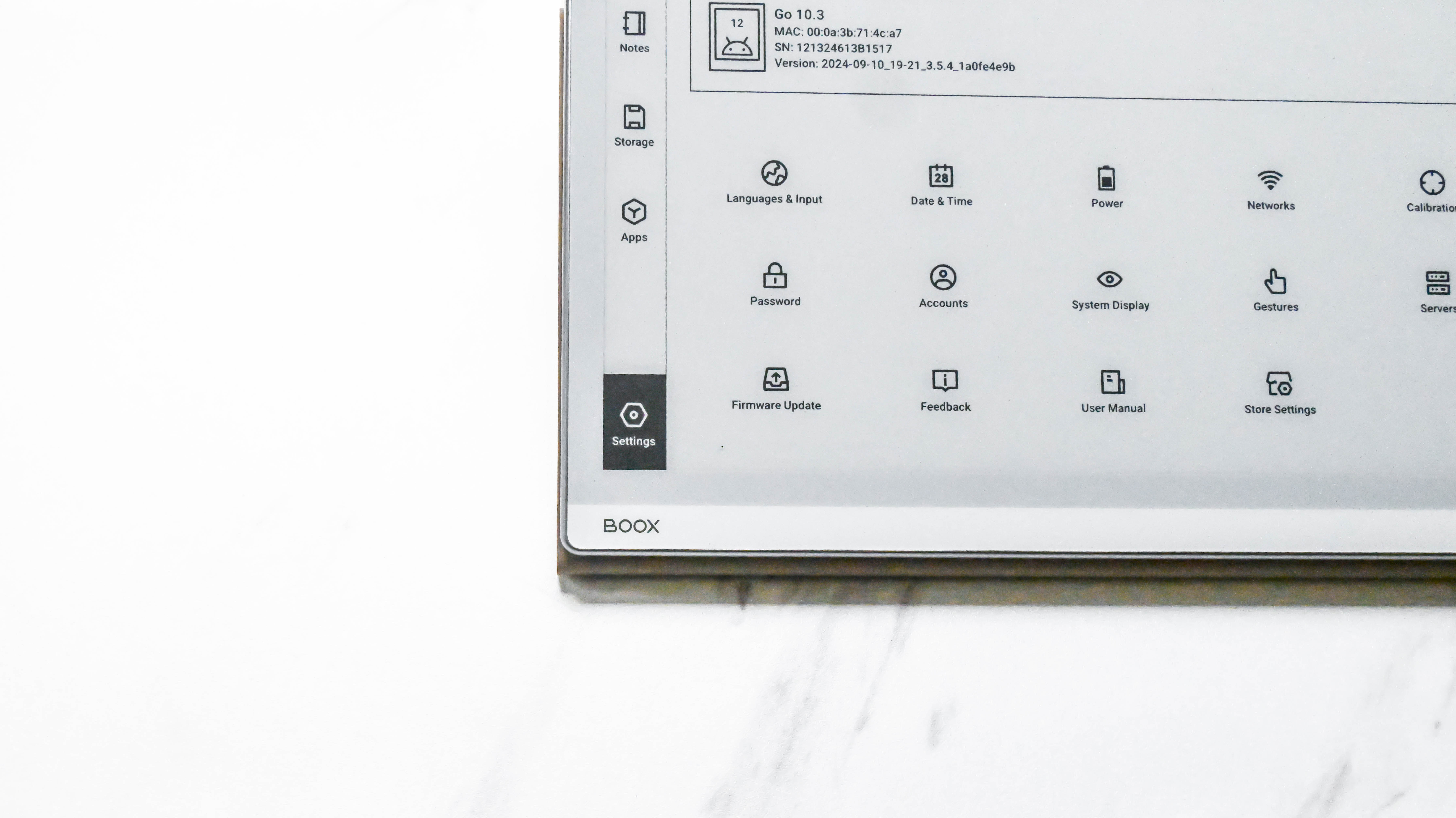
As mentioned earlier in this review, the Boox Go 10.3 runs a custom, trimmed-down version of Android 12 that focuses purely on reading and writing. Importantly, Onyx has also used this focus to streamline the user interface on the Go 10.3, which makes it a much easier Boox tablet to use than any I’ve tested before.
I suspect it’s this better UX that has eliminated a lot of the software issues I had with the Onyx Boox Go Color 7, or the company put all its efforts into the bigger flagship tablet and didn’t test out the smaller ereader enough before release. Whatever the reason, it means the Go 10.3 is a superior writing tablet that can give the reMarkable 2 a run for its money.
So while you won’t get the smartphone experience here, you will be able to download third-party apps from the Google Play Store, which makes the Go 10.3 a more versatile writing tablet than anything from the competition.
Android OS and apps
- Customized Android UX
- The most streamlined UX of any previous Boox writing tablet
- Not all third-party apps are usable
All current Boox devices run on a customized version of Android – Android 12 in this case – which is how you’re able to get access to the Google Play Store. Despite the OS being a little out of date compared to what you’d get on the latest Android phone, it’s not an issue for an e-paper tablet.
The Boox already has full support for Evernote and OneNote, as well as easy syncing to cloud services like Dropbox and Google Drive, but you can also download and use other apps that you prefer. One thing to keep in mind is that not all of them will offer stylus input if the developer hasn’t allowed for it on the Android version of that particular app, or there could be input delays when rendering the writing on screen, which happened to me when trying Evernote.
Another thing to keep in mind when using an e-paper tablet like the Go 10.3 is that not all apps are optimized for this kind of display. Practically every app on the Play Store will have been developed for use on an LCD or OLED display – so a smartphone or a multimedia tablet – and E Ink’s screen tech doesn’t respond as well. Firstly, the screen refresh rate isn’t fast enough for most non-productivity applications, so while you can watch videos on YouTube in black and white, it’s not the best experience. You can play some mobile games (again, in black and white), but your graphics won’t be as clean as on your phone or regular tablet, and that’s despite the Go 10.3 using a mid-range Qualcomm Snapdragon 680 processor paired with an Adreno 610 GPU.
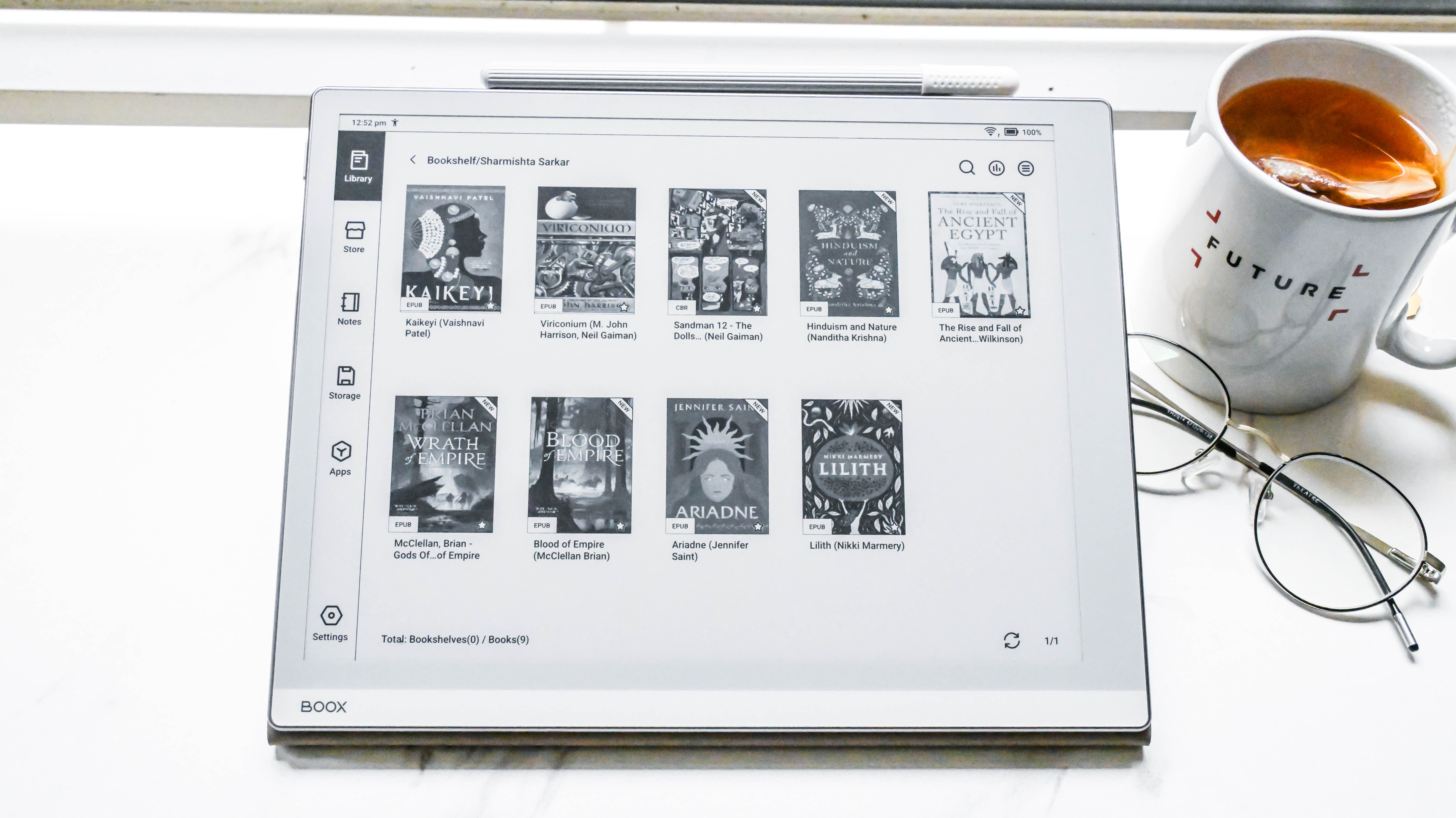
What I really like about the Go 10.3 over other similar Onyx Boox note-taking tablets is the overall user interface – it’s a lot cleaner and streamlined here, and isn’t plagued with the same software glitches I found when I tested the Boox Go Color 7. The only problem is that the default Fonts folder in the Settings isn’t connected to the Storage tab where it needs to live – so anyone sideloading fonts will need to create a new Fonts folder under Storage to make them work on NeoReader (the native library app).
The main applications are arranged to the left, making navigation simple, and an easy swipe up from the bottom bezel exits the app you're on. The system settings are also more streamlined, but there are still plenty of customization options within the System Display tab and Gestures. The latter is similar to what you’d find on other Android devices which, I personally think, is a bit of an overkill for the Go 10.3 but I’m sure other users would appreciate the various options.
As with other Boox devices, there’s also a NaviBall, which is optional to use. Tap on this circular icon and it will open a selection of up to nine configurable buttons to trigger up to 30 different functions.
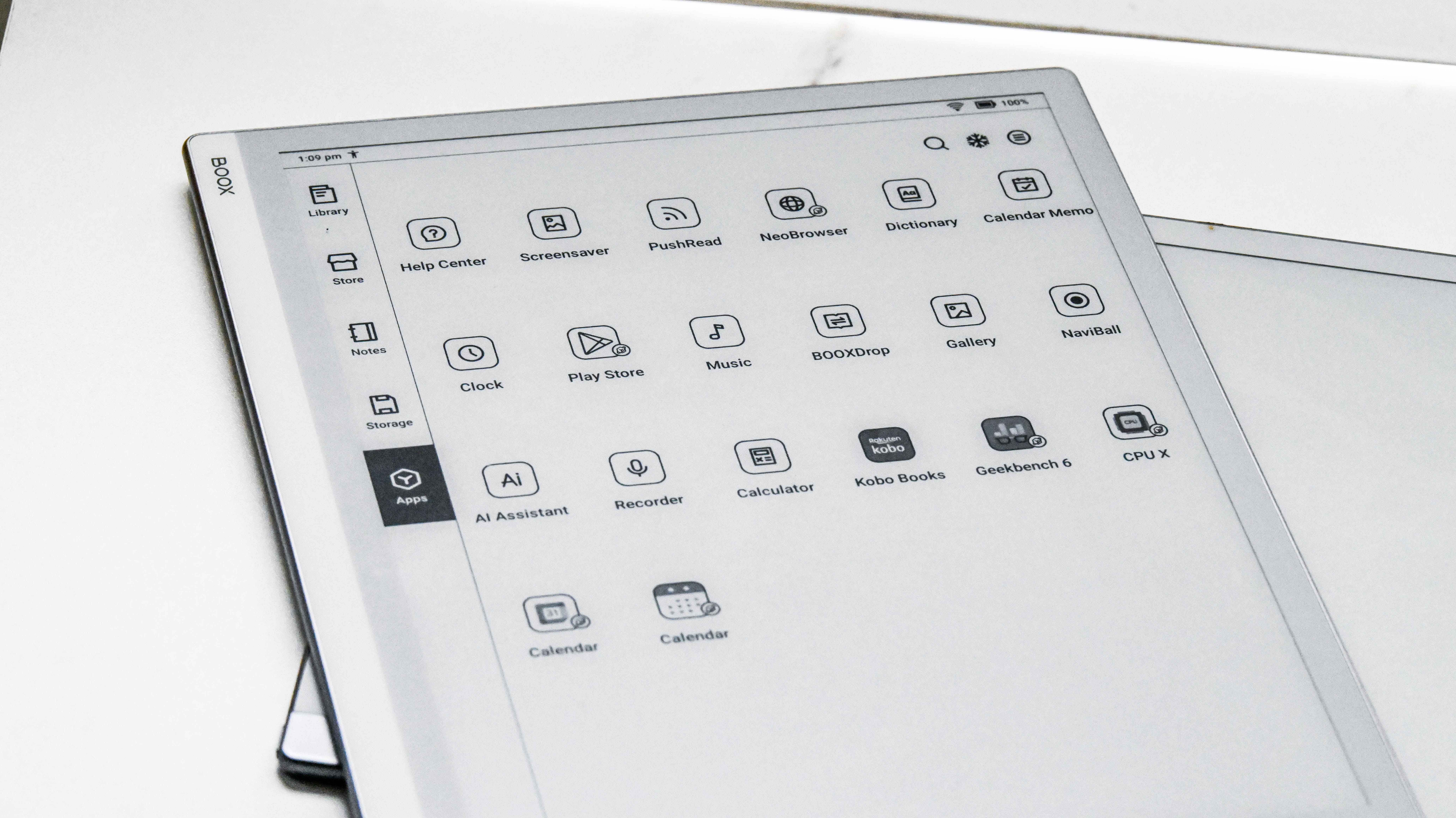
You also have the Control Center on the Go 10.3 which is an easy way to access specific features like the AI assistant, Boox cloud storage, Kids Mode, Split Screen and, importantly, the E Ink Center. The last option is the most useful in my opinion as this is where you can control a lot of the system settings for the device, especially adjusting the refresh rate from a choice of four speed settings. Better yet, you can set individual apps at different refresh rates to suit.
The one feature on any Boox device that’s been the least useful is the built-in bookstore. You’ll typically find titles that are already in the public domain, but considering you can always use the Kindle or Kobo app on the Go 10.3, you can ignore the Store tab entirely. You can also use the native browser to make purchases online.
One thing to note here: like the Boox Go Color 7, the Go 10.3 doesn't register on a Mac device's Finder application, which makes it hard to transfer files via a cable. It does, however, register on a Windows machine, but I found that existing files cannot be found via the usual pathways. The best way to use this Boox tablet is via cloud sync.
• Software score: 4 / 5
Writing & productivity
- Native note-taking app is great but might be overkill for some users
- Broad support for note apps and cloud services
- Excellent stylus input
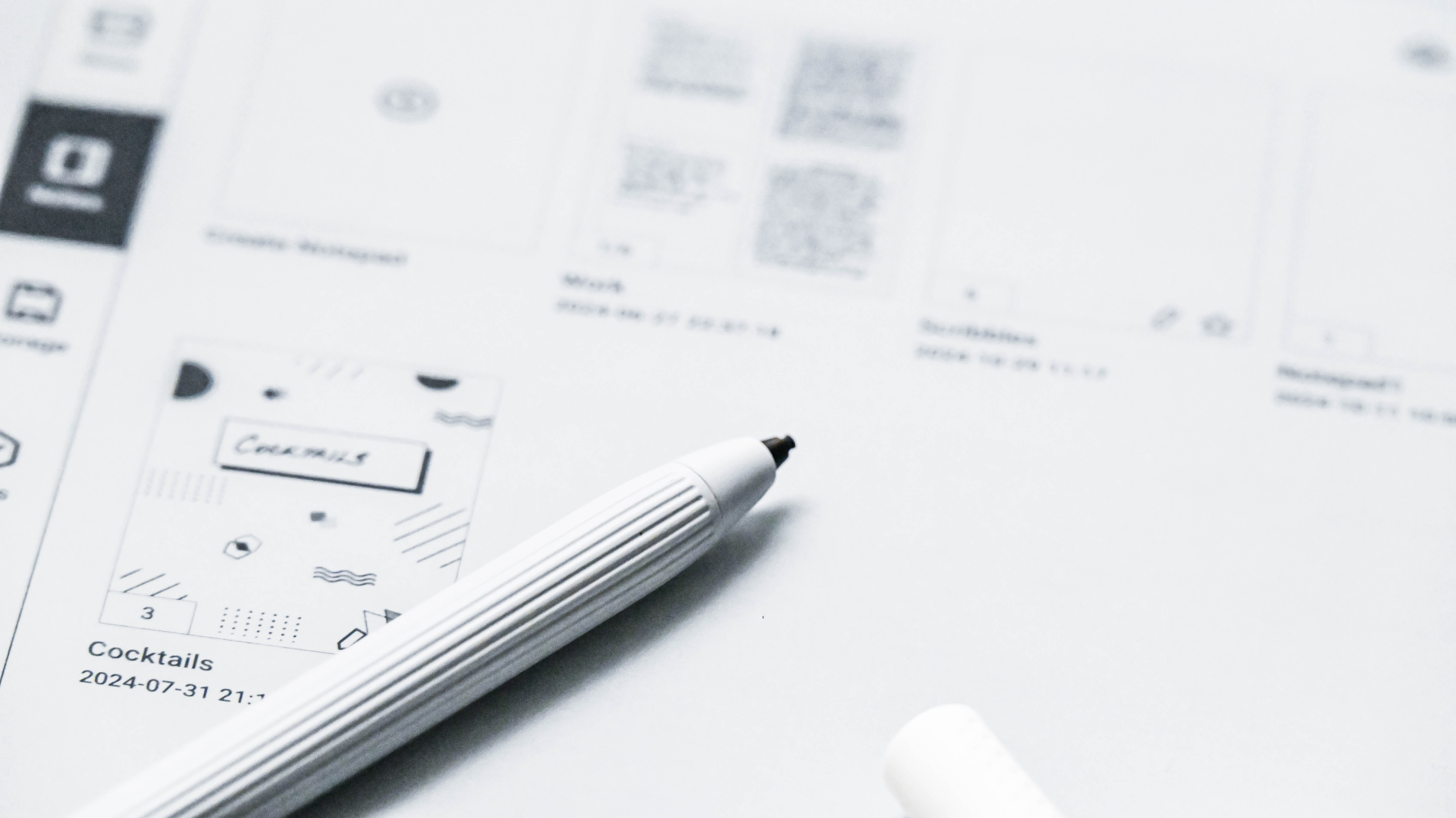
When it comes to writing, the Go 10.3 has excellent stylus input – there was never any lag during my testing. That said, I did have the input fail a few times on the native Notes app (where a line appeared on screen the moment the stylus touches it), and a full restart of the tablet was needed to fixed the problem. I’ve encountered this issue on the Kobo Elipsa 2E as well, but the latter allows for just that page to be refreshed, which solves the problem quicker than on the Boox.
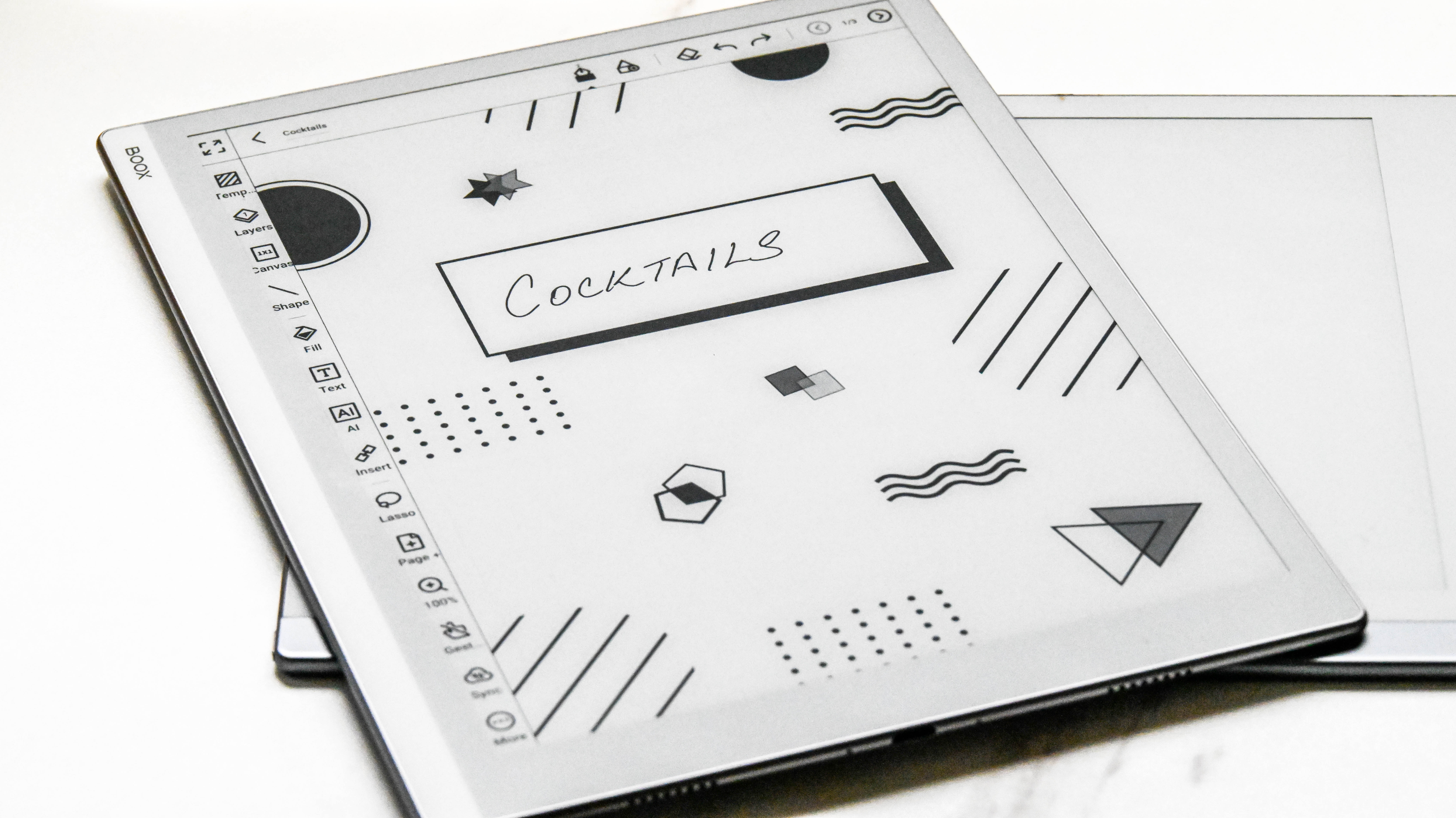
Despite being a grayscale device, there is support for a handful of colors on the Go 10.3. You’ll see the options when you choose a pen or brush type in the Notes app and, when exported – as a PDF or PNG file – you’ll see those colors displayed on your computer.
There are five pen types to choose from, each with up to five thickness (width) levels.
There’s a heck of a lot of other functionalities within the Notes app itself, so you really don’t need a third-party application for writing or drawing, unless you’re syncing them to a specific cloud account.
You can add shapes and layers for, say, flowcharts and you can insert links to notes as well. The AI icon helps convert handwritten notes to text and, for the most part, the conversion is correct unless your handwriting is literally chicken scratches. Similar to the reMarkable 2, the Go 10.3 is excellent for annotating PDF files – you can fill forms and sign on the device, then export to your computer or a cloud service of your choice. There’s also image-to-text support (OCR) available if you need it, which will make pretty much anything within the powerful Notes app searchable.
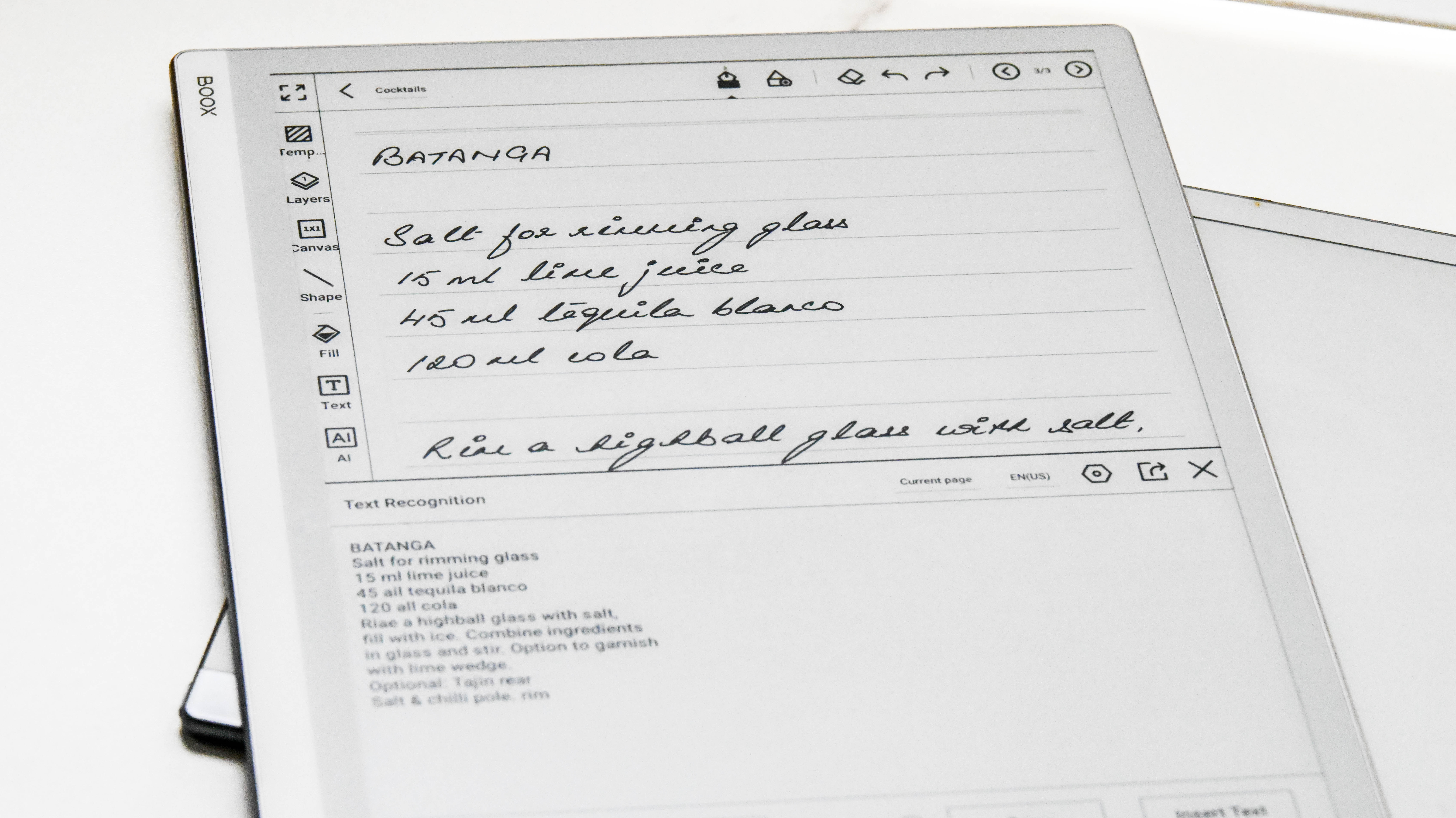
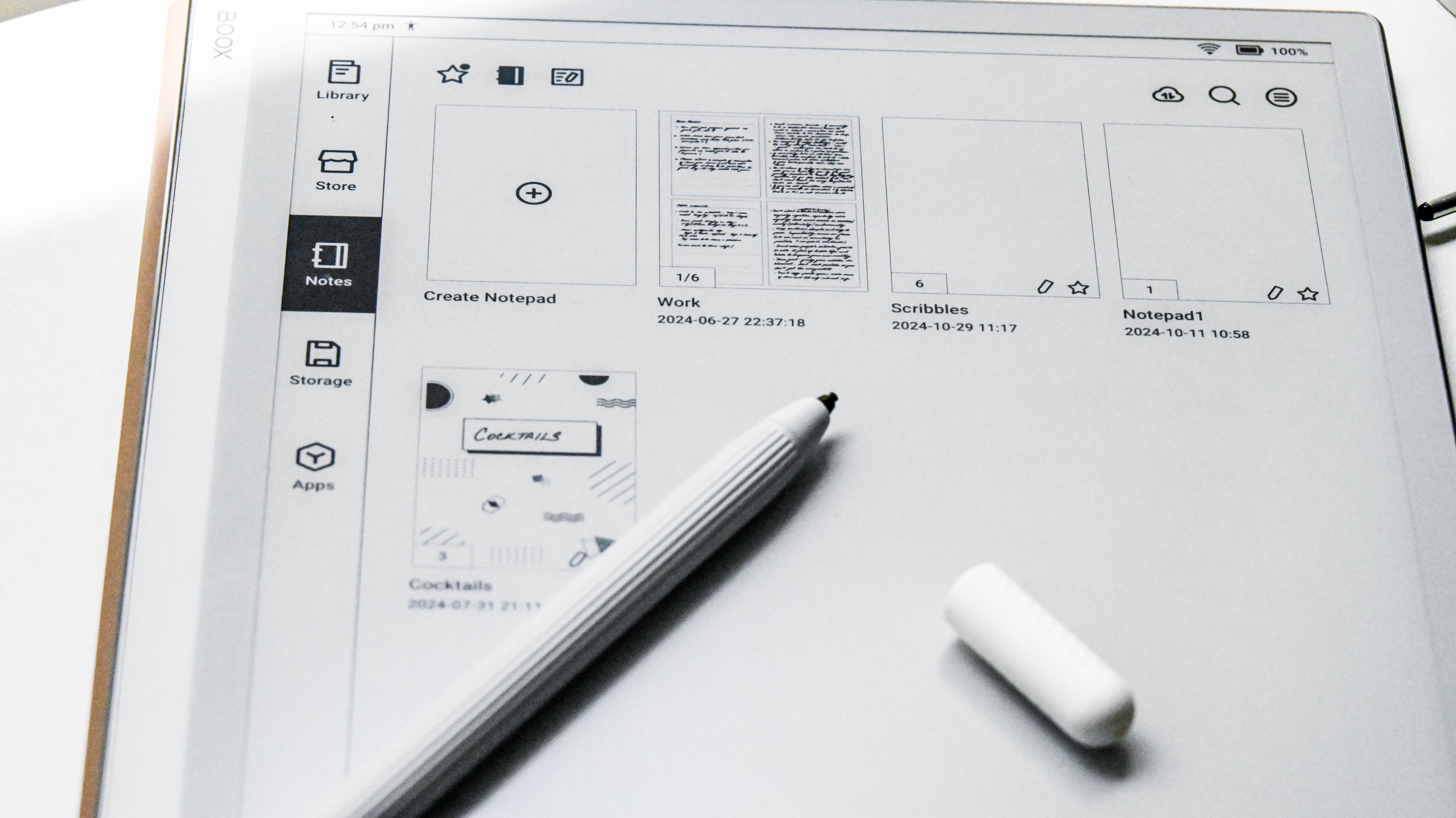
Each document can have up to 500 pages, but I found that the bigger the notebook gets, the slower it is to reopen the next time you want to access it on the Go 10.3. This happened with a 7-page document, and the largest I had during my testing was 10 pages, so I’m not entirely sure how well a 100-page document will perform, let alone 500 pages. The aforementioned 10-page document even crashed once during my testing period.
The one thing I wish the native Notes app had was an easier way to delete individual pages within a document. This functionality exists, but is hidden away: you need to tap on the page number displayed on the top right corner, which opens the individual pages on a side panel. There, you need to spot the three dots for each page and then select ‘delete’. It’s a lot easier to do this on other writing tablets like the reMarkable 2, the Kobo Elipsa 2E and the Kindle Scribe.
Another missing feature for multi-page documents is tap-to-turn – you have to use the arrow icons on the top right corner to navigate page by page, or open the side panel to reveal all the pages.
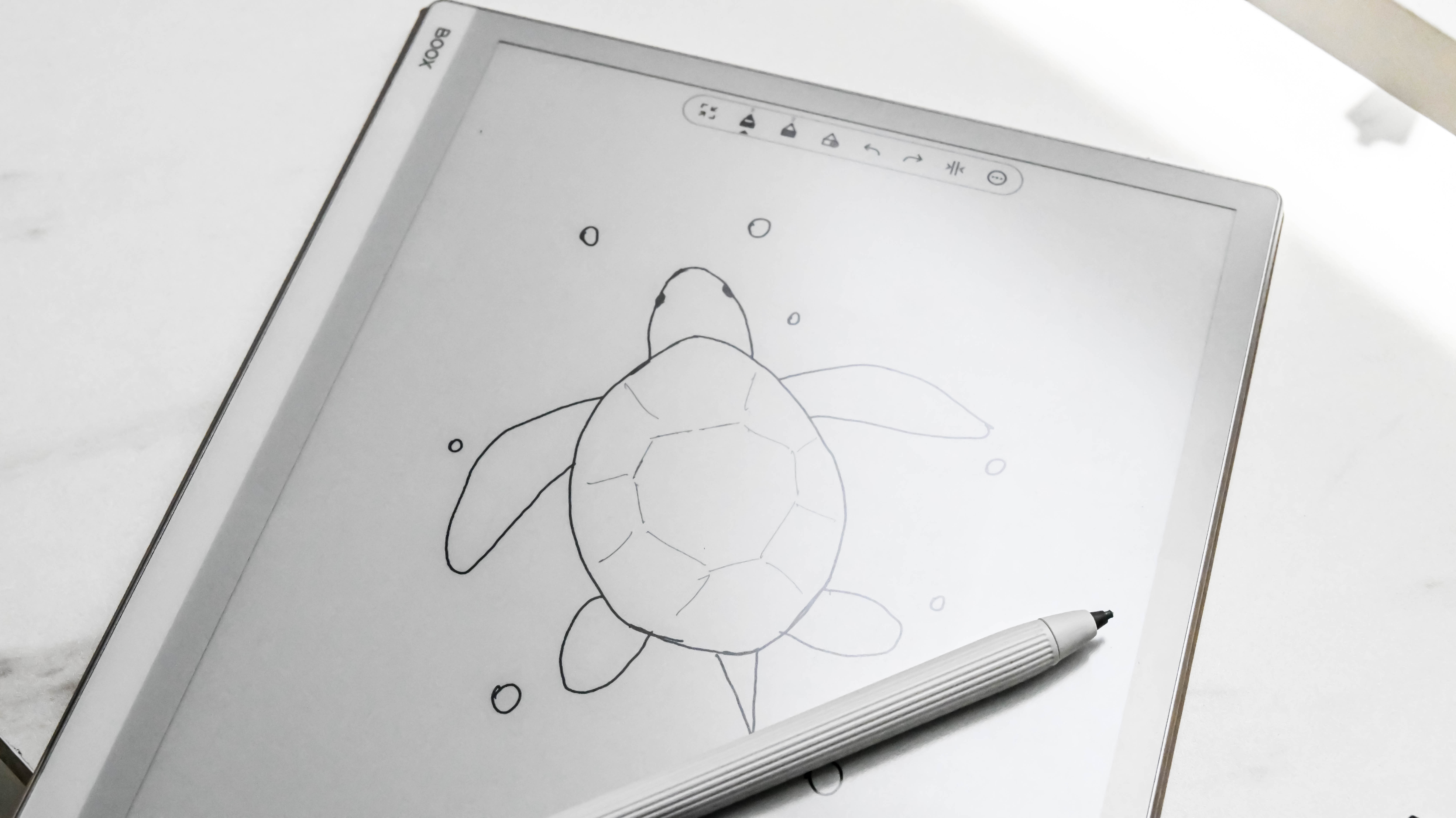
If you’re a digital artist, the Go 10.3 will make an ideal sketchpad. There’s 4,096 pressure sensitivity levels that can capture nuances of the stylus quite well, with brush strokes looking quite detailed on the E Ink display. That said, there’s no tilt support on the Go 10.3, which you will get on the reMarkable 2.
• Writing and productivity score: 4.5 / 5
Reading
- Native library app is full featured
- Default Fonts folder is not linked for use
- Lacks a screen light for nighttime reading
Like the native Notes application, the baked-in NeoReader is also full-featured and has been built for e-paper screens. Text is sharp and very readable on the grayscale display and the customizable Floating Toolbar is handy for quick access to shortcuts. However, comparing the 300ppi display on the Go 10.3 with the 227ppi Kobo Elipsa 2E shows a marked difference in contrast – the lower resolution screen has darker text, which makes it stand out more without the frontlight on.

On the Go 10.3, however, the lack of a light – which it borrows from the reMarkable 2 – makes it hard to use as an ereader for nighttime reading. So if you want your e-ink tablet to double as both an ereader and a note-taker, you might be better off looking elsewhere.
And while there’s wide font support, the NeoReader only has a single (unnamed) serif option available for use without dedicated weights or stylization (like bold and italics). While you can sideload a plethora of fonts, they don’t get saved within the default Fonts folder – instead, you need to create a new one within Storage for the additional fonts to be enabled within the library app.
If you happen to already have a Kindle or Kobo account, I personally recommend them over NeoReader, although the customizations here will be limited to what the two platforms allow on their Android apps. The page setup, though, is cleaner and makes reading a nicer experience. And, as I’ve previously mentioned, the built-in bookstore isn’t worth checking out at all.
• Reading score: 3.5 / 5
Onyx Boox Go 10.3 review: Performance
- Minimal ghosting compared to other Boox tablets
- Responsive screen
- Decent battery life, but significant drain in sleep mode
The combination of the mid-range Snapdragon 680 CPU and the Adreno 610 GPU is plenty to keep the Go 10.3 ticking along real nicely. During my testing, I noticed no issues with core tasks like writing and reading.
It’s arguably one of the best writing experiences I’ve had on an e-ink tablet, with absolutely no stylus input lag, although I found some multi-page handwritten documents can take a little longer than expected to open. One of my documents, which was 10 pages, even crashed, although I think I’ll put this down as a one-off as it happened just once. That said, launching Android apps is quite fast for a device like this and can match some budget phones or traditional tablets.
Individual apps can have their own refresh rates set, which is excellent, although even at the fastest speed, some apps might stutter. This includes the browser which, when scrolling through rapidly, will have a few hiccups. That’s natural, though, as it’s just how e-ink screens are.
One improvement I’ve noticed on the Go 10.3 compared to other Boox tablets is the lack of ghosting. During my testing, I experienced only the mildest when I was using the browser, but had no issues when using the Notes app to write or draw. I did have the occasional overlay when using the NeoReader but, again, it was significantly less than other Boox devices.
Without a screen light, the 3,700mAh battery can go quite the distance – depending on how much you use the Go 10.3, it can last 2-3 weeks on a single charge. However, there is a significant drain when the tablet is in sleep mode. I found it can drop anywhere from 2% to 10%, depending on how long it stays inactive. Onyx gets around this issue by allowing you to let the device power down completely after a day or two of inactivity (you can select this in the Settings pane), but even then I found a little battery drain. While this issue might be fixable via a future firmware update, it can mean that a full charge could last no more than a week.
Moreover, if you use the built-in speakers for listening to audiobooks or music, you might end up draining the battery a little faster than when using it for just writing and reading. And while sound quality isn't the best for music, it's perfectly adequate for audiobook narrations and can get quite loud within a small room. I personally prefer using one of the best wireless headphones for listening on any e-ink tablet.
Topping up the battery isn’t too bad – I found the Go 10.3 went from 20% to full in approximately two hours. This is when plugged into a 65W wall charger and using a high quality USB-C to C cable (not the provided one) – it will be slower to juice up if you plug the device into a PC, laptop or a docking station, or if you use a USB-A to C cable.
• Performance score: 4 / 5
Should I buy the Onyx Boox Go 10.3 e-paper tablet?
Buy it if...
You want the lightest, thinnest e-paper writing tablet
Thinner and lighter than even the reMarkable 2, the Boox Go 10.3 is arguably the best-looking 10-inch e-paper writing tablet I've tested. It's just a shame that the stylus doesn't secure well to the side or the top of the device.
You want access to Android apps on your e-ink tablet
There are plenty of 10-inch e-paper writing tablets to choose from these days, but the ability to use third-party Android apps might just prove to be advantageous to some users.
You want to do more than just read and write on the e-ink tablet
It might not support stylus tilt functionality, but the Boox Go 10.3 is still wonderful to draw on. And writing is just as great, if not better, with no input lag to complain about. Better yet, it's got built-in speakers, so you can listen to music or audiobooks (even stream via the Android app of your choice).
Don't buy it if...
You want your writing tablet to double as your ereader as well
While you can read on the Boox Go 10.3 just fine, the lack of a frontlight means it's not much use in the dark, when many an avid reader would love to wind down with a good book.
You need more than 64GB of storage
For an expensive tablet, it's a shame that the Boox Go 10.3 has no expandable storage – especially since there are other Boox devices that come with a microSD tray that can support up to an additional 1TB of data.
You'd prefer a more budget-friendly option
Most 10-inch e-ink note-taking tablets are expensive, but if you don't mind opting for a smaller device, like the Kobo Libra Colour or the Kobo Sage, you can save a lot of money despite having to purchase the stylus separately.
Also consider
reMarkable 2
It might be getting a little long in the tooth (having released in 2020), but this Scandinavian writing tablet nails productivity perfectly. No distractions, minimalistic user interface and a remarkable (pun intended) writing experience. If you have some extra cash, the keyboard folio can be real handy.
Read our in-depth reMarkable 2 review for more details
Amazon Kindle Scribe
While there's a new (2024) edition of the Scribe available now, the original Amazon writing tablet is a little cheaper and a very good alternative if you want a 10-inch e-ink note-taker. It's the only such device to support Microsoft Word documents natively and it's screen is arguably one of the most well-optimized displays I've tested.
Read our full Amazon Kindle Scribe review to learn more
Kobo Elipsa 2E
It's not the smoothest screen to write on, but the note-taking features in Kobo's Advanced Notebooks is par excellence. Handwriting recognition is also one of the best I've tested and, to me, this is arguably the best alternative to opt for if you want both an ereader and a writing tablet in one.
Read our full Kobo Elipsa 2E review for more information
If you prefer something smaller and cheaper, you can opt for the Kobo Libra Colour – you'll get a 7-inch color display and the full Kobo writing suite, but you will need to purchase the stylus separately.
Check out our in-depth Kobo Libra Colour review to learn more
How I tested the Onyx Boox Go 10.3
- Used the device for approximately two months
- It became my main writing device during that time
- Did some reading and listened to some audio files as well
The first thing I did when I took the Go 10.3 out of its box was to sign into my Onyx account to sync existing notes across from previous Boox tablets I've used. I then signed into my Google account to transfer some ebooks to the tablet and access the Play Store.
Previous experience with Boox devices had already taught me to avoid the built-in bookstore, so I promptly downloaded both the Kindle and Kobo Android apps to access the libraries I've built up on those two platforms. I also downloaded a couple of benchmarking applications to determine what CPU was being used (Onyx doesn't make it very clear on its site) and check the battery stats.
The Go 10.3 then became my daily note-taker – I used it for a lot of work-related notes, including jotting down points for this review – and, even though I'm no artist, I did try drawing some simple sketches. All my notes are synced to my Google Drive account for access on a laptop or PC, and I also exported a couple of documents to cloud storage as PDFs for printing.
Given this is a writing tablet first and foremost, I tested the native Notes app thoroughly, but also tried out Evernote briefly.
Read more about how we test
[First published October 2024]
Comments
Post a Comment