Adobe Creative Cloud (2024) review
Adobe Creative Cloud is the hub of your Adobe existence. This is where you can launch any Adobe app you’ve installed on your computer (probably the most superfluous feature in its arsenal), where you can find and install new ones, review any files you’ve saved on Adobe Cloud. It's also a space where you can find tutorials for top Adobe apps, and browse the stock media libraries of Adobe Stock. The interface has had a major makeover since we last reviewed the app, so we thought it was time to delve back in there and see how this nexus of activity works in 2024.
Adobe Creative Cloud: Pricing & plans
- Creative Cloud itself is free, but you need it to manage your other Adobe software, and for that, you need a subscription. It’s not cheap, but it might offer value for money.
In and of itself, this software is free. You will need an Adobe ID to make use of it, but that’s also free. After that, you have to choose a subscription plan to grant you access to some, most or all of Adobe’s portfolio. The prices vary depending on whether you’re an individual, in education, or a business, but for illustrative purposes, we’ll be looking at costs for individuals here.
Most apps, the top of the line ones such as Photoshop and Premiere Pro, will each cost you $23 per month. There is some fluctuation though: Adobe Acrobat Pro is $20, Adobe Express $10. If you want access to most of Adobe’s portfolio via its ‘all apps’ package, you can do so for $60 a month.
These prices are for what Adobe calls ‘annual billed monthly’. This is effectively a 12-month contract, paid each month. Monthly subscriptions are available, but are more expensive. Annual upfront subscriptions are the cheapest way to access Creative Cloud. Certain apps offer you a free trial, but you can also get a refund, as long as you cancel your subscription within 14 days.
- Pricing & plans: 4/5
Adobe Creative Cloud: The Apps
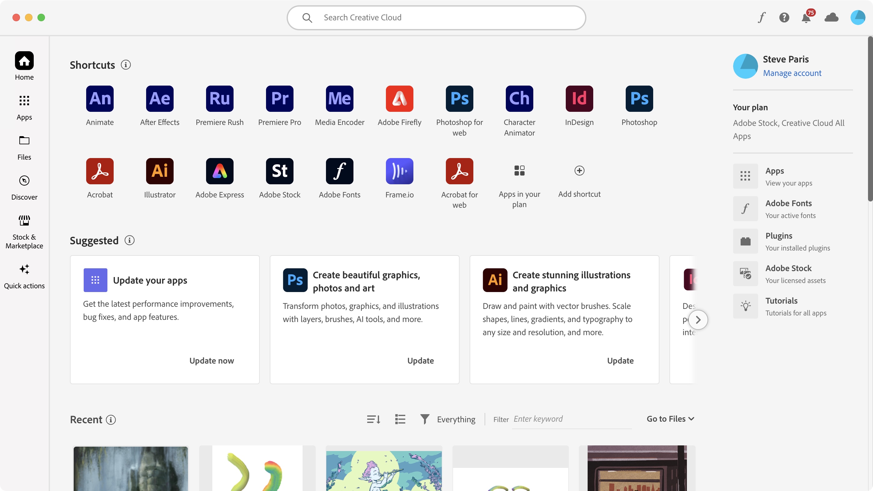
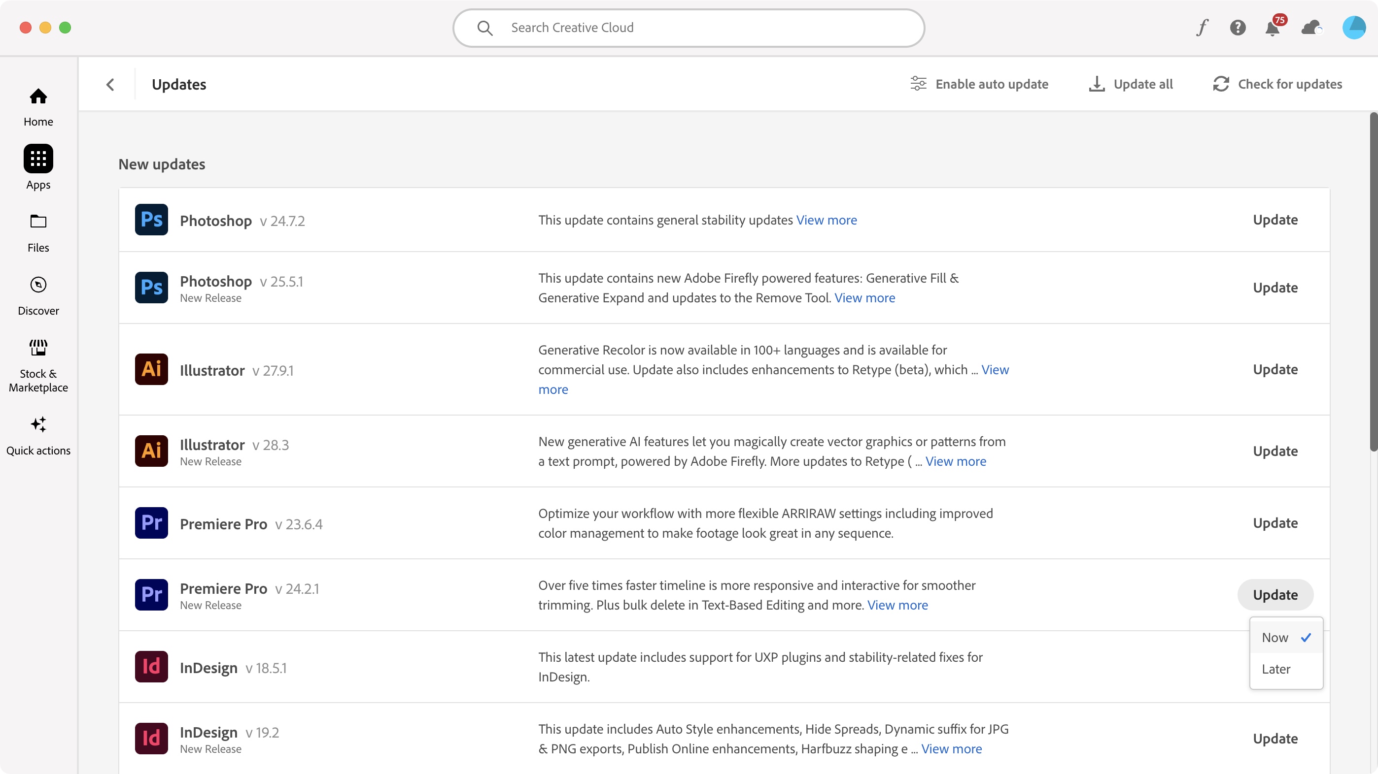
- This is the core of the app’s purpose, and it does a fantastic job at managing your software. You can install new ones, delete others, and update them all, in a very easy to use interface.
Adobe Creative Cloud has evolved since we last visited it. Everything feels more streamlined, which makes it easier for you to find what you’re after. For instance, the sidebar’s main focus used to be on categories, letting you choose ‘Photography’, or ‘Video’, or ‘3D' for instance. There was also a dedicated Fonts section there, which was superfluous since you also had a Font button top right of the interface. So gone is the old sidebar, and in with the new.
You now start with a Home button, showing you pre-assigned shortcuts to apps you’ve installed on your machine (this is customisable), followed by current information about relevant apps, a view of the latest files you’ve stored on Adobe Cloud, and quick links to Adobe Express, and Firefly - the AI art generator and assistant that’s infused across Adobe products.
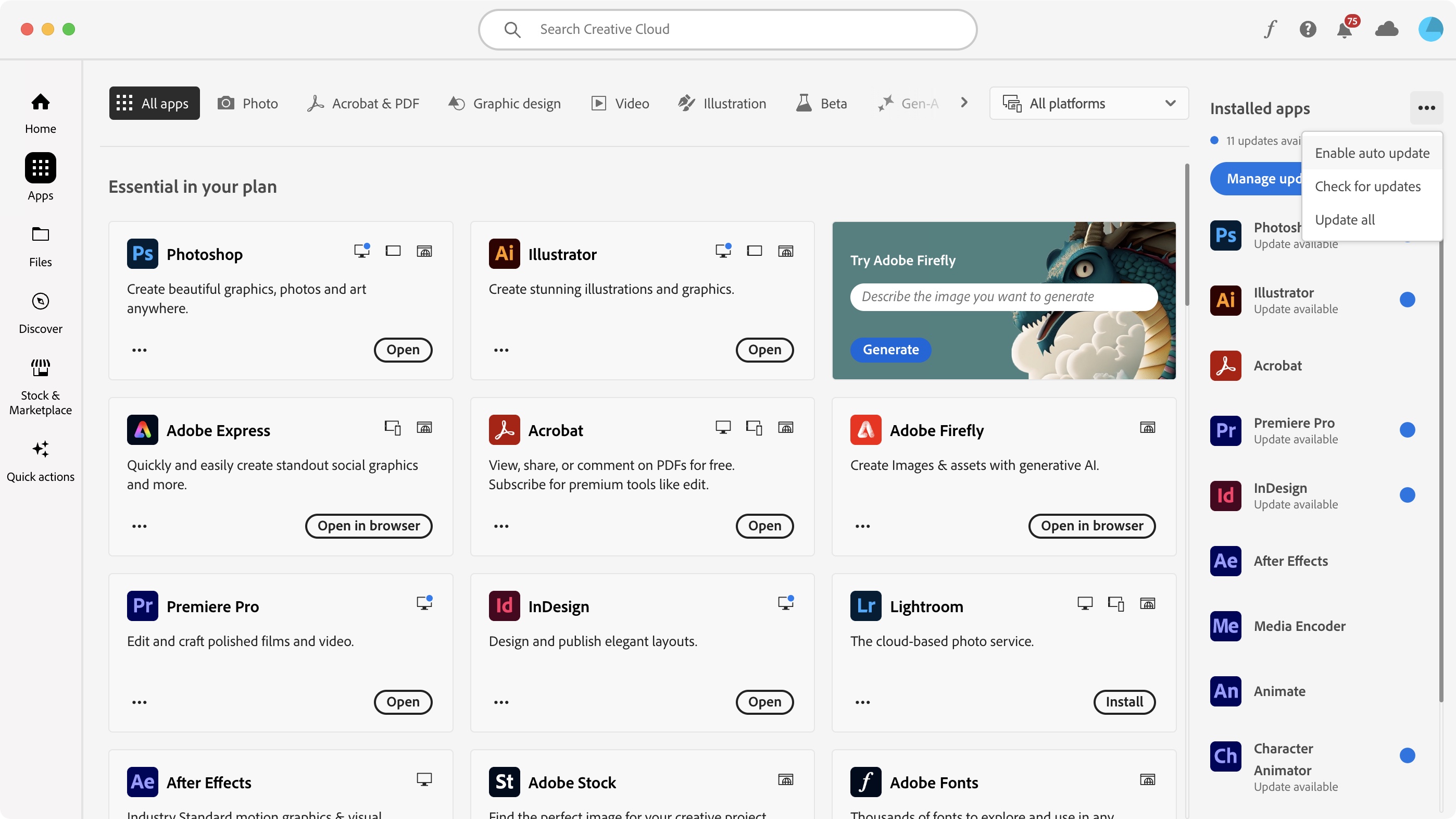
Next is ‘Apps’, where you may well be spending most of your time. Here, you can manage all your available Adobe software, from installing new ones, to removing others, and keeping them all up to date.
We appreciate the fact you have full control over such updates, from manually choosing what gets updated, to letting Creative Cloud download and install everything as it gets released. When it comes to major updates, you can also choose to keep the old version as you install a new one, a crucial feature if you’re currently working on a project, and don’t want to risk the new changes unintentionally messing up your work, while also staying up to date.
- The apps: 5/5
Adobe Creative Cloud: Tutorials
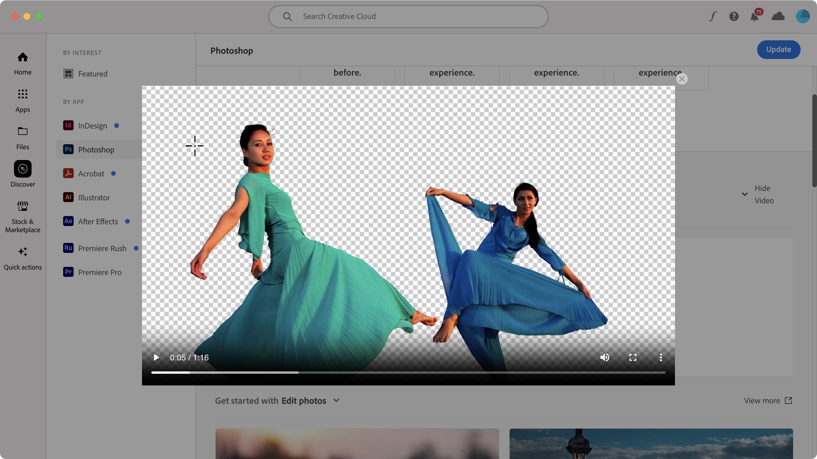
- Having a place where you can learn more about some of Adobe’s apps is most welcome - but links force you out of the app and into your web browser.
The ‘Discover’ section isn’t new. In fact, it had its own menu top left of the interface in the previous version, although that menu was pretty subtle and easily missed. Now however, it’s much more front and centre, having its own dedicated space on the left sidebar. This makes it much easier to find and explore.
Seven apps are covered, including Acrobat, Photoshop, Premiere Pro, and Adobe InDesign, and through Discover, you get access to video tutorials, tips and tricks articles. You can also get support from Adobe’s community. Although most videos and live streams can be accessed from within the Creative Cloud interface, clicking on the other two will take you out of this software, and into your web browser. It’s not ideal, and we did find it somewhat disruptive, but the concept and (most of) the implementation is fine.
- Tutorials: 3/5
Adobe Creative Cloud: Stock media
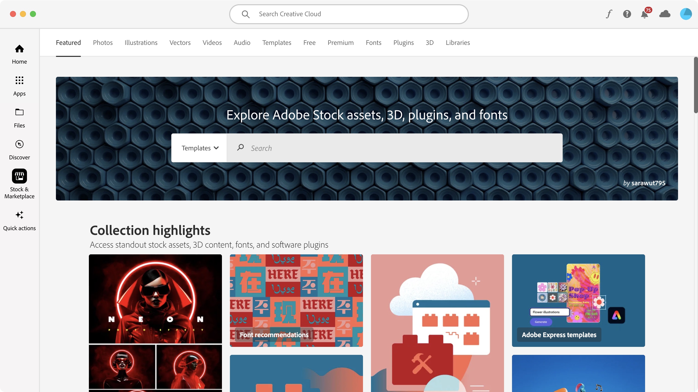
- The ‘Stock & Marketplace’ section looks great and appears to be full of features, yet everything you click on just takes you to your web browser.
Another important facet of Creative Cloud is its link to Adobe Stock. Click on ‘Stock & Marketplace' to be graced with a busy interface. You’ve got tabs at the top representing various categories, such as Photos, Audio, Templates and Plugins, followed further down by a large search field with the ability to filter your results, and after that, a long list of featured items, represented by large thumbnails.
All this sounds great, but it’s all just a veneer: no matter what you type on, you’ll be taken to a new page in your web browser. Even the search field is window dressing, and typing anything in it also directs to the browser. It’s not the most user-friendly interaction, forcing you to juggle between two apps. Because of this, it feels unfinished, like one of those old Western movie towns, where everything is just facades of buildings, with nothing behind them.
All in all, Creative Cloud is most useful to keep track of the Adobe apps you’ve installed on your computer, but there are other features which could make it attractive for those seeking information and new media for their project. It’s a shame though that more often than not, Creative Cloud will still take you to a web browser, which is never an ideal interaction. Still, it’s an improvement over the previous version, and the sidebar, and the layout of the information is better than ever. It’s an invaluable control centre for Adobe’s apps, but it could be so much better when it comes to the additional features.
- Stock media: 3/5
Adobe Creative Cloud: Scorecard
Should I buy?
Buy it if...
You have an Adobe subscription, need to manage its apps installed on your computer, browse for relevant information, and look for additional media.
Don't buy it if...
You're not an Adobe user - and don't need access to all apps and tutorials.
- Avoiding Adobe? Try the best Adobe Lightroom alternatives and the best alternatives to Adobe Photoshop
Comments
Post a Comment