Samsung Galaxy Z Fold 2
Two-minute review
Calling the Samsung Galaxy Z Fold 2 as the best foldable device would be a gross disservice to everything it manages to achieve. Even in its current form, it more than proves that foldables will not only be a lot more mainstream but also that the future might not be that far away.
As a person that goes through dozens of smartphones each year, the Z Fold 2 was really the only phone whose honeymoon period had to be measured in days and not hours. We’d go as far as saying that it is the only foldable worth getting if your budget permits that. Even with all its quirks and shortcomings, it quintessentially gives us a glimpse at the future of smartphones — a period where they are not held back by their physical limitations.
Weeks later, I think I am still not over the Samsung Galaxy Z Fold 2.
Owing to the unique nature of the device, our Samsung Galaxy Z Fold 2 review will focus on the aspects that are significantly different with this form factor and try to answer the question around whether foldables are ready for prime time, instead of trying to convince those who already are.
If you consider yourself to be a tech enthusiast but were too young to remember the transition from brick-sized handsets to the svelte smartphones of today, this might be your chance at witnessing the next big thing to happen to mobiles.
The Samsung Galaxy Z Fold 2 is the successor to the original Fold, which was the first mainstream foldable smartphone. It builds upon the concept in every way, addressing almost every issue we had with its forerunner. Both the displays, the smaller one on the outside and the flexible one on the inside, make major strides in terms of quality, size and usability. When unfolded, it’s like using a tablet with a 7.6-inch display that is almost square, ideal for running multiple apps at once. The cover display upgrades might seem more significant though, as it grows in size to cover the entirety of the front of the folded Fold 2, making it much easier to use. In a time when content consumption is at an all-time high, you’ll quickly understand why the ability to switch between a tablet and a phone at a moment’s notice is so easy to love.
While the inner display continues to be an engineering marvel, Samsung has also managed to improve its refresh rate, touch and screen-to-body ratio. However, the two major issues from its predecessor continue to persist, just at a much lower degree: the crease and the plasticky feel. The new Ultra Thin Glass (UTG) implementation takes it much closer to an actual glass display, but not quite. You will still have to be careful and conscious with it. It is also inherently amongst the least water-resistant smartphones you can get right now.
Everything else about the Fold 2 feels stronger, especially the retooled hinge that can prop open the phone at multiple positions. Samsung’s variable screen mechanism is coupled with what it calls Flex Mode, which automatically reshuffles the UIs of certain apps. It’s limited to a few apps, but the major ones are covered. New ones will be added in the future.
In case you plan on using the Samsung Galaxy Z Fold 2 as a normal phone, here’s what you need to know: the cameras are not the best that Samsung has to offer; that’ll be the Note 20 Ultra. It has five perfectly good cameras with three at different focal lengths on the back, and one for selfies in both the displays. Fast charging tops out at 25W, which feels a little slow in comparison to the competition. Some apps don’t scale well to the odd aspect ratio, making them a pain to use. The included accessories in the box are also limited to just the charger and cable now, doing away with the earphones and a case.
On one hand, we’re wowed by what Samsung has been able to pull off in a time when the industry is lagging behind, making the Z Fold 2 ideal for those who seek thrill from novelty. But as innovative as it is, it costs a pretty penny for something that has far too many caveats — many of which seem to be focus points for the upcoming Samsung Galaxy Z Fold 3. And, 2021 is also likely to finally see some competition in the foldable space, which might finally bring some new approaches to the problems plaguing the category. We might be looking at one of the most significant year-on-year improvements if the speculations are anything to go by.
For everyone else whose purchase decisions aren’t driven by FOMO but by practicality, a phone like the Note 20 Ultra or any of the other dozens of Android flagships will serve well enough. You should not buy a foldable unless you really want one, because for most general use cases, a regular phone might just suffice… just that you’re unlikely to be blown away.
We’re not saying that any phone is worth so much money, but if there is one phone that is worth so much, it is the Samsung Galaxy Z Fold 2.
Price in India
Samsung Galaxy Z Fold 2 specs
Weight: 282g
Display size: 7.6-inch / 6.2-inch
Resolution: QXGA+ (1,768 x 2,208)
Refresh rate: 120Hz
Software: Android 10, OneUI 2.5
Processor: Snapdragon 865 Plus
RAM: 12GB
Storage: 256GB
Rear cameras: 12MP + 12MP + 12MP
Front cameras: 10MP + 10MP
Battery: 4,500mAh
IP Rating: Not waterproof
Launched in India in September, the Samsung Galaxy Z Fold 2 is priced at Rs 1,49,999, putting it on par with global pricing. Colour options include Mystic Bronze and Mystic Black. In some other markets, the colour of the hinge can also be customized. Only a 256GB storage configuration is available, which can not be expanded via a micro SD card.
At that price, it is cheaper than its predecessor by a fair bit. Samsung flagships are also known to receive price cuts in the months following the launch, so it might be useful to track its pricing before finalising the purchase.
Design
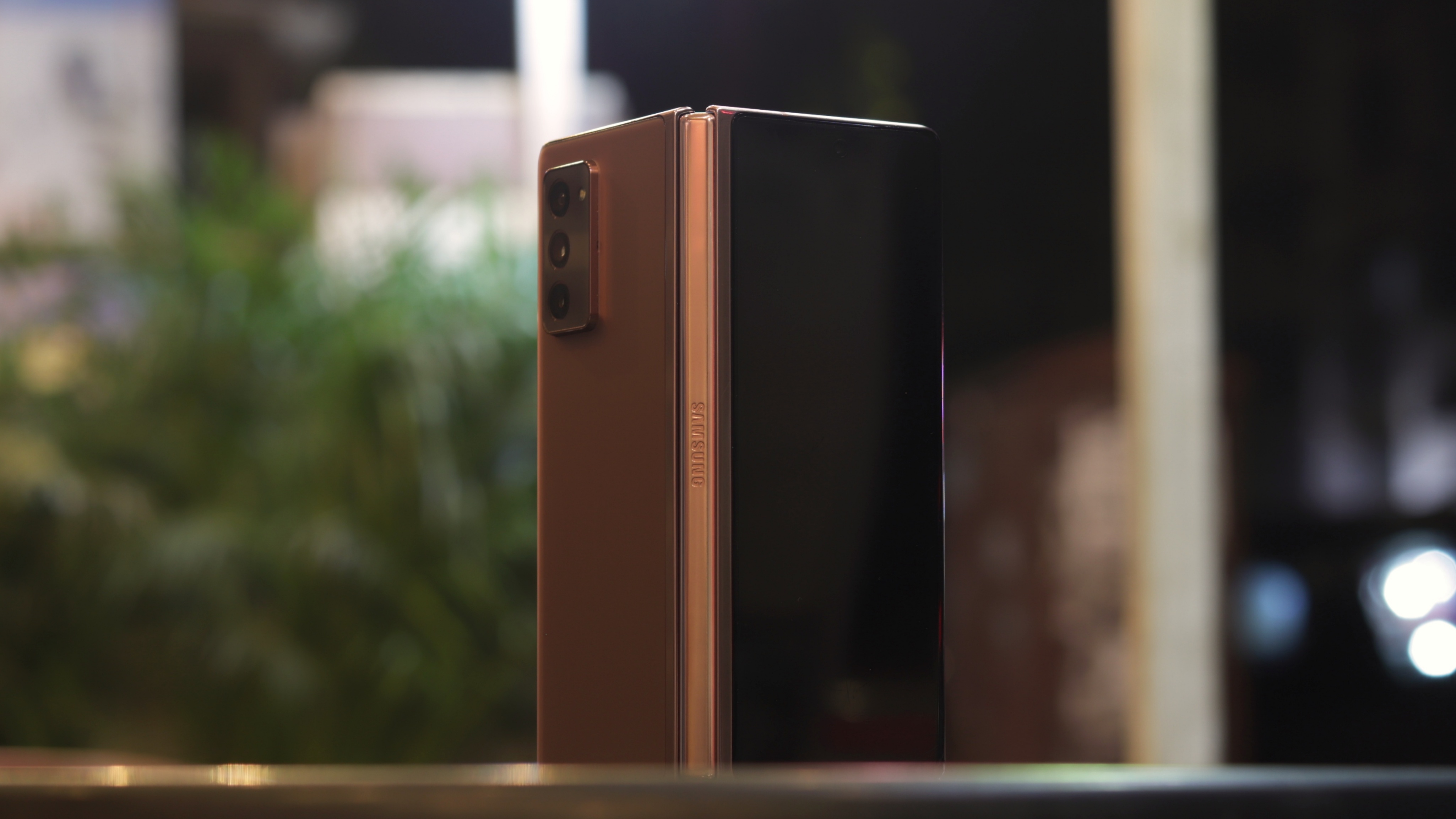
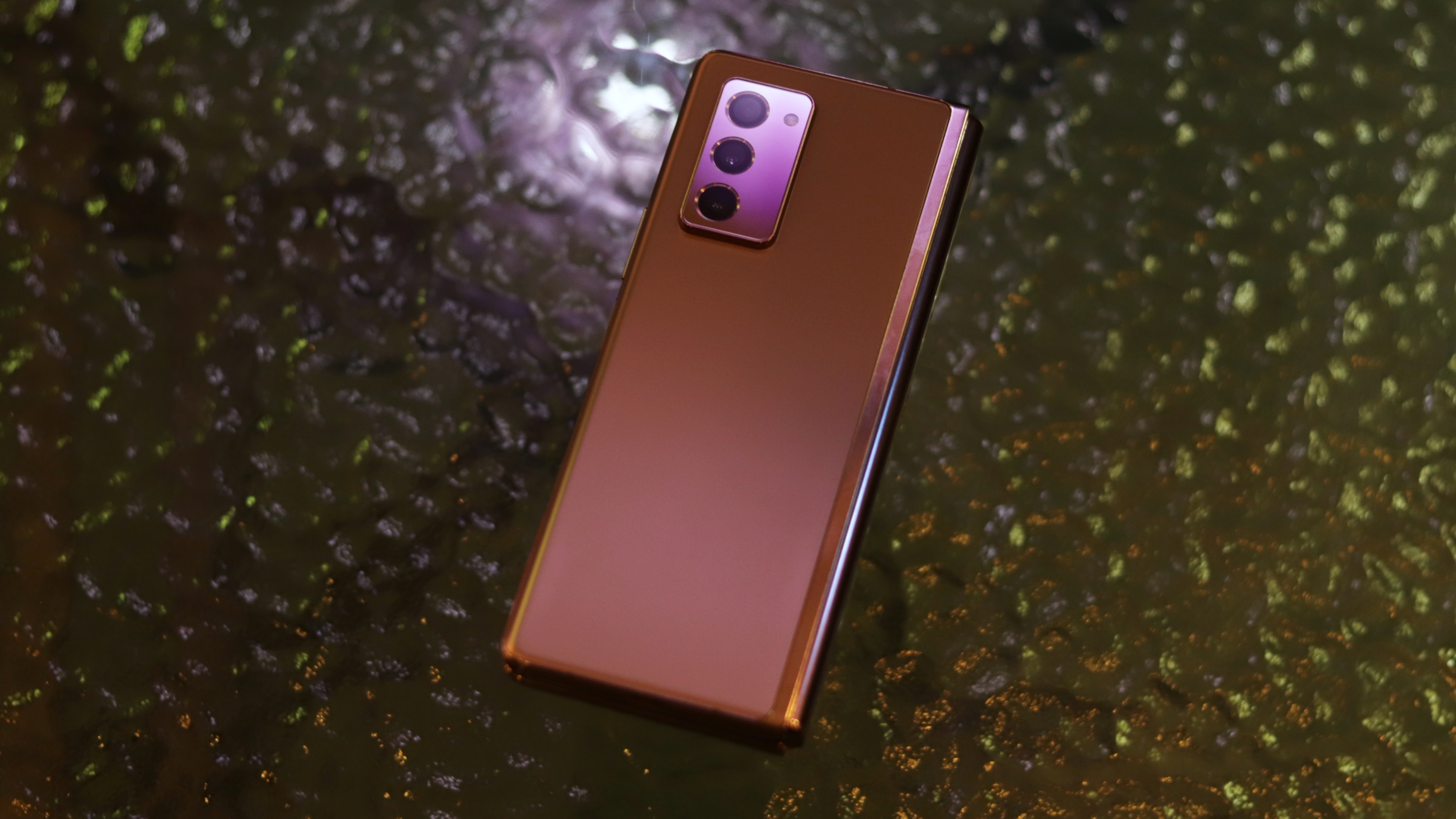
Even without giving it the leeway of being a transformer, the Z Fold 2 is actually a very well-designed phone for the most part. Unlike the original Fold, it doesn’t feel like an experiment that needs constant babying. It’s a proof of concept that foldables as a category can exist, and even thrive once the state of technology improves.
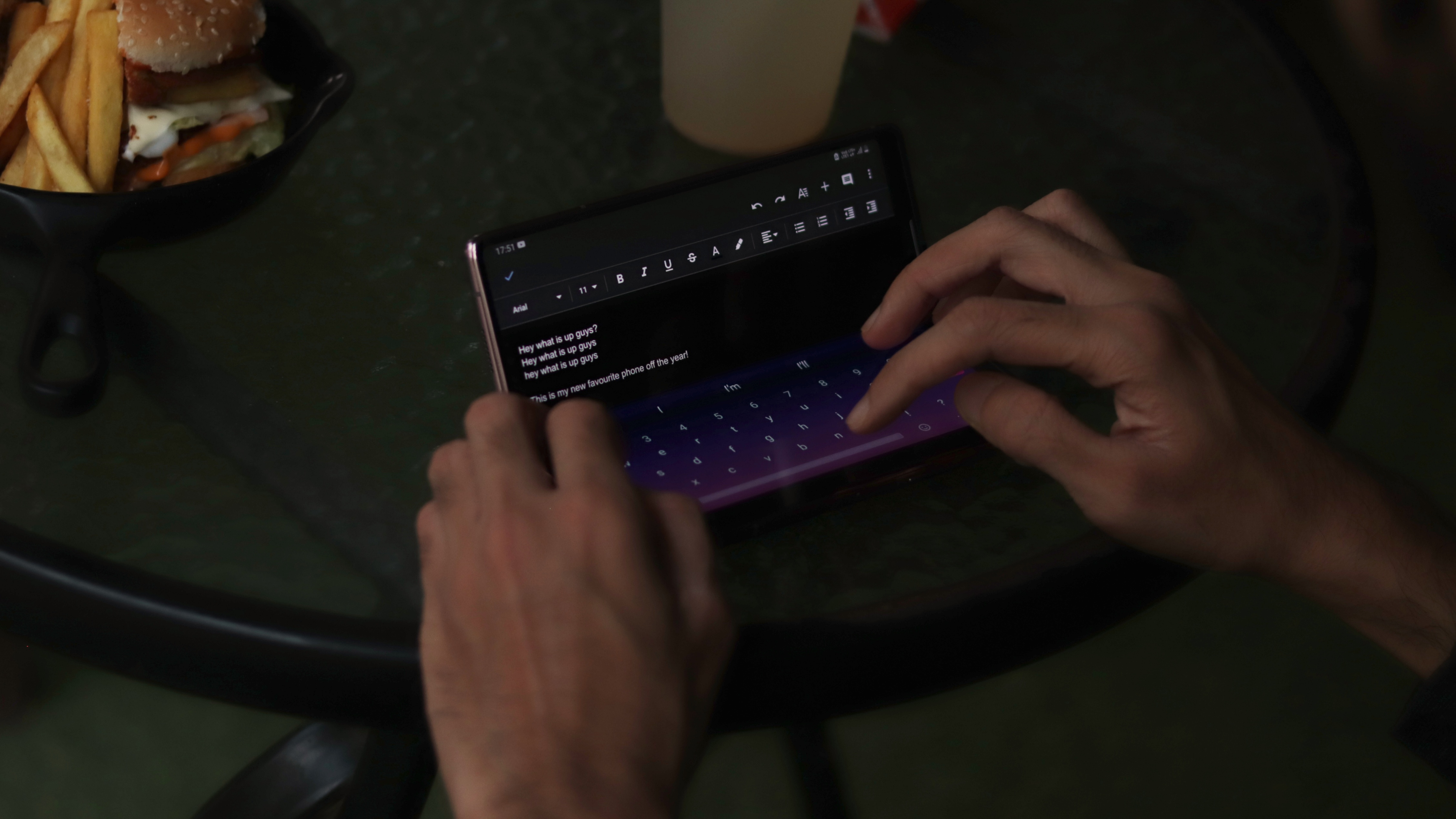
Each time we’d unfold the Z Fold 2, we’d be awestruck at how close to perfection it felt. This is primarily due to the improvements made on the hinge — the part that actually enables all the folding goodness. The new backbone can now hold the other half at any angle between 75 and 115-degrees, allowing for some useful use cases. We’ll talk more about how to make the most of this ahead, but for what you need to know now, the hinge has the right amount of tension to feel reassuring… just don’t try to pry it open with one hand. Some of the more common instances were using it as a tiny laptop or propping it up for video calls.
The hinge gets some upgrades on the inside too, in the form of finer bristles that try to guard the internals at the necessary gap along the phone’s spine. It’s still not exactly dust-proof, but should be able to take care of the daily ingress protection.
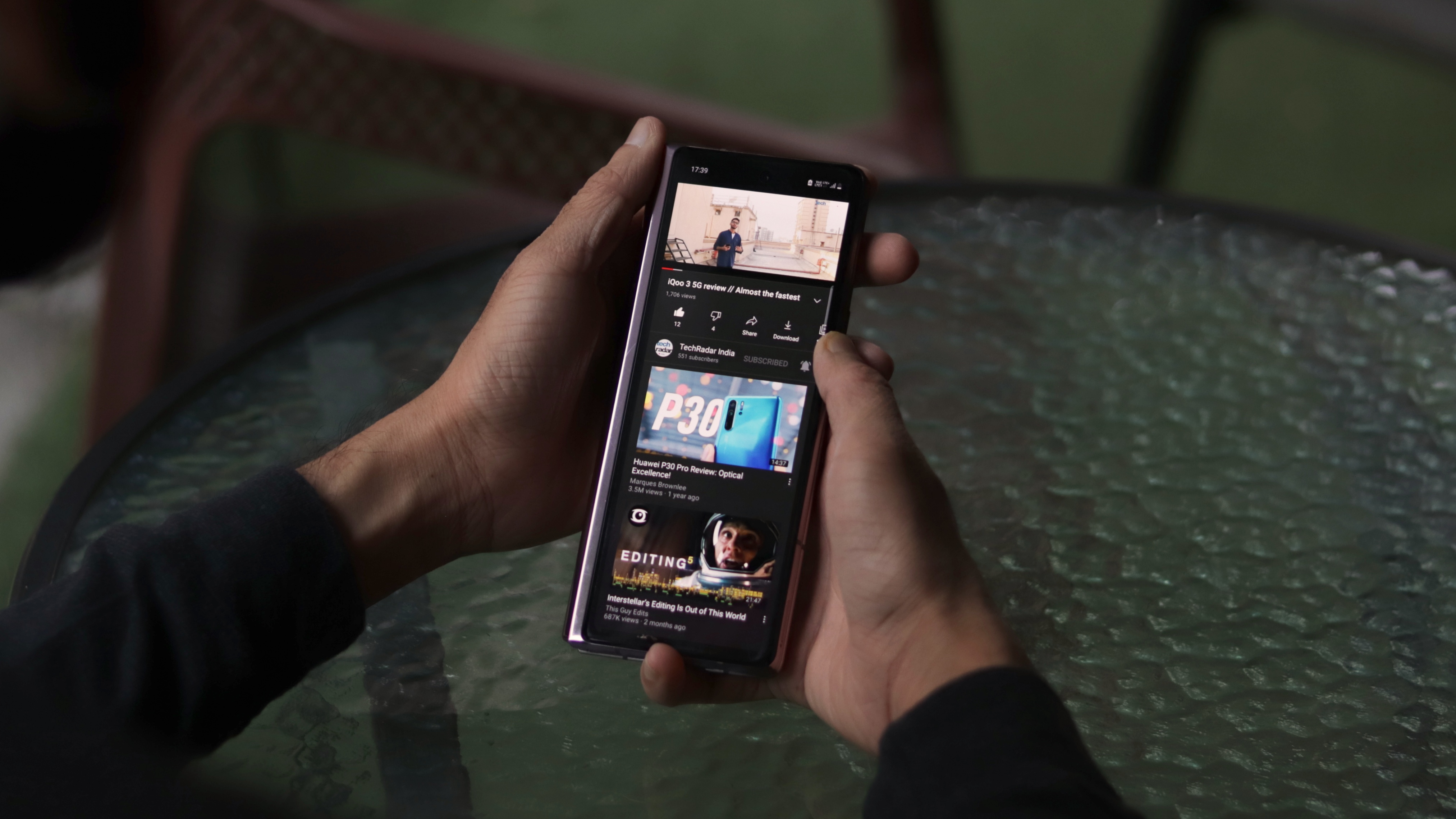
Given all the cutting-edge tech packed into such a narrow (when folded) device, here’s the most non-shocking statement of this review: this phone is thick. Coming in at 16.8mm, it becomes the thickest phone around. Here’s something that might actually shock you though: it’s surprisingly comfortable to use with one hand when collapsed. The narrow frame assisted by the thickness makes it fit really well in the natural curvature of the palm. For all the quick actions and replies where you don't feel the need for the bigger display, it really doesn’t feel uncomfortable.
You’ll also notice how thoughtful the design is, with the cover display having a 2.5D curved glass on one side for easier swiping, to the logo engraving on the hinge that provides some additional grip.
When opened, the Samsung Galaxy Z Fold 2 is just 6.9mm thick with excellent weight distribution, making it easy to carry with one hand around like a small book. Reading articles or scrolling through social media became so much easier with no more squinting or adjusting needed. Of course, if you have smaller hands, you shouldn’t try hand gymnastics with an expensive gadget.
There's a set of stereo speakers too, on the top and the bottom of the left half of the folding screen. They get plenty loud, and their location ensures that they will never really get covered or muffled.
It takes a lot of design cues from the Note 20 Ultra too, such as the squared-off design, a prominent camera housing, an iconic Mystic Bronze hue, etc. The only other major change is the fact that the fingerprint scanner is now embedded within the power button - a move which makes sense as in-display scanners require you to literally press hard into the display.
Aspirational today; inspirational tomorrow.
Summing things up, the Z Fold 2 shows how much of a lead Samsung has over other foldables with a design that is not only pretty, but also very functional and reliable. Reaching complete ingress protection and damage resistance might take a few more years, but for now, this is as good as foldables get.
Display
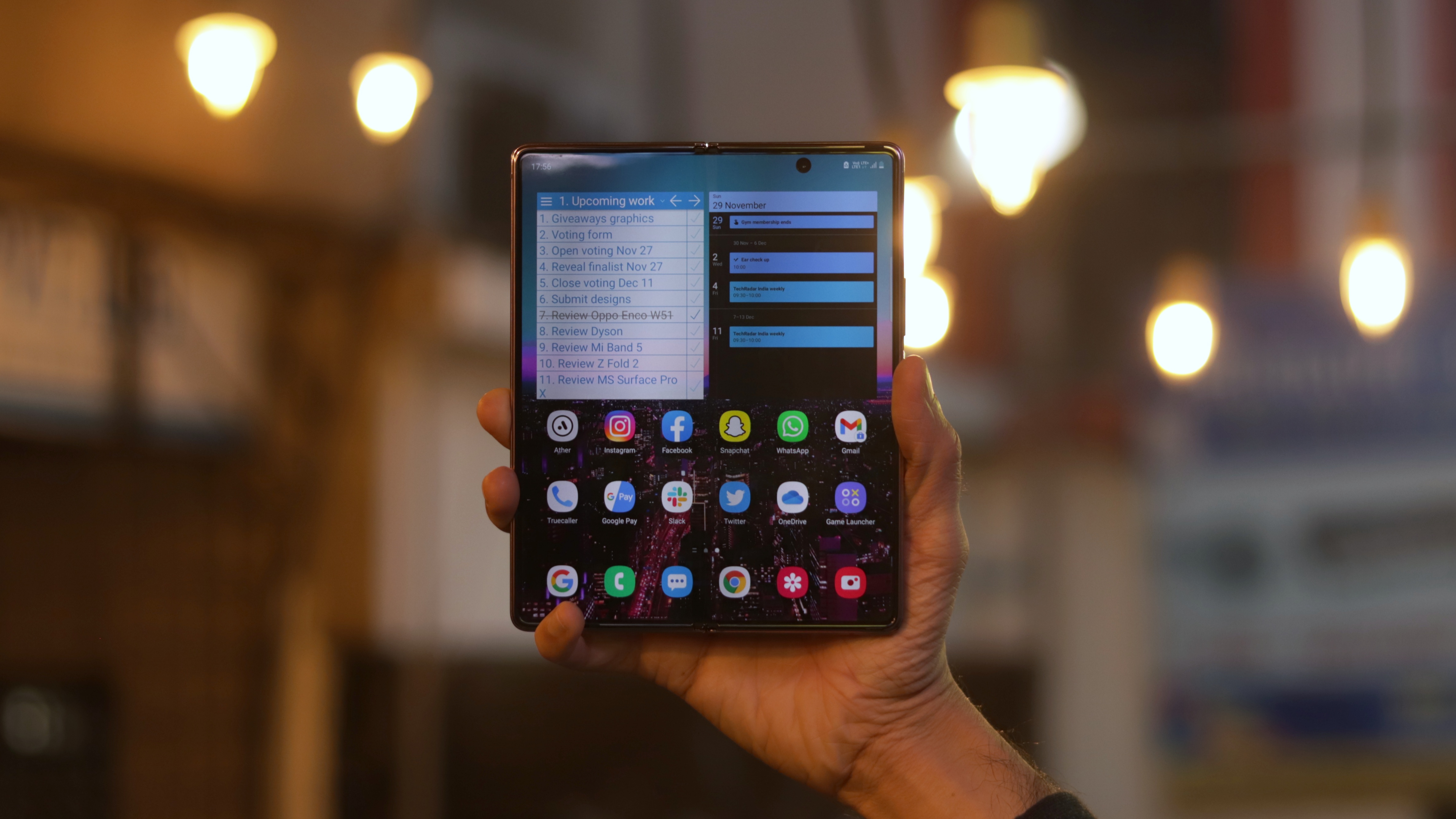
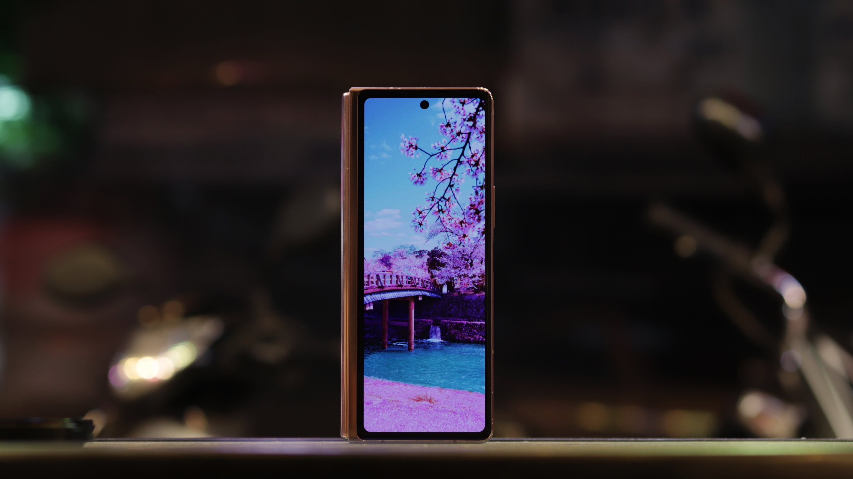
This is by far the most important aspect to keep in mind while considering any foldable. Even while it is the Z Fold 2’s weakest link, Samsung’s solutions are worth applauding here. Let’s talk about the hardware differences first.
Being an “innie”, it has a smaller screen on the outside and a bigger, flexible screen on the inside. The cover display now spans almost the entirety of the front of the phone - a welcome change from the measly 4.6-inch front screen that made the original Fold’s feel as if it contained more black bezel than the actual screen. It’s also gently curved from the right side, making single-handed usage a little more comfortable.
With the outer screen now being of “usable” size, you’ll not have to be extremely conscious at dividing your usage between quick actions and meaningful content consumption.
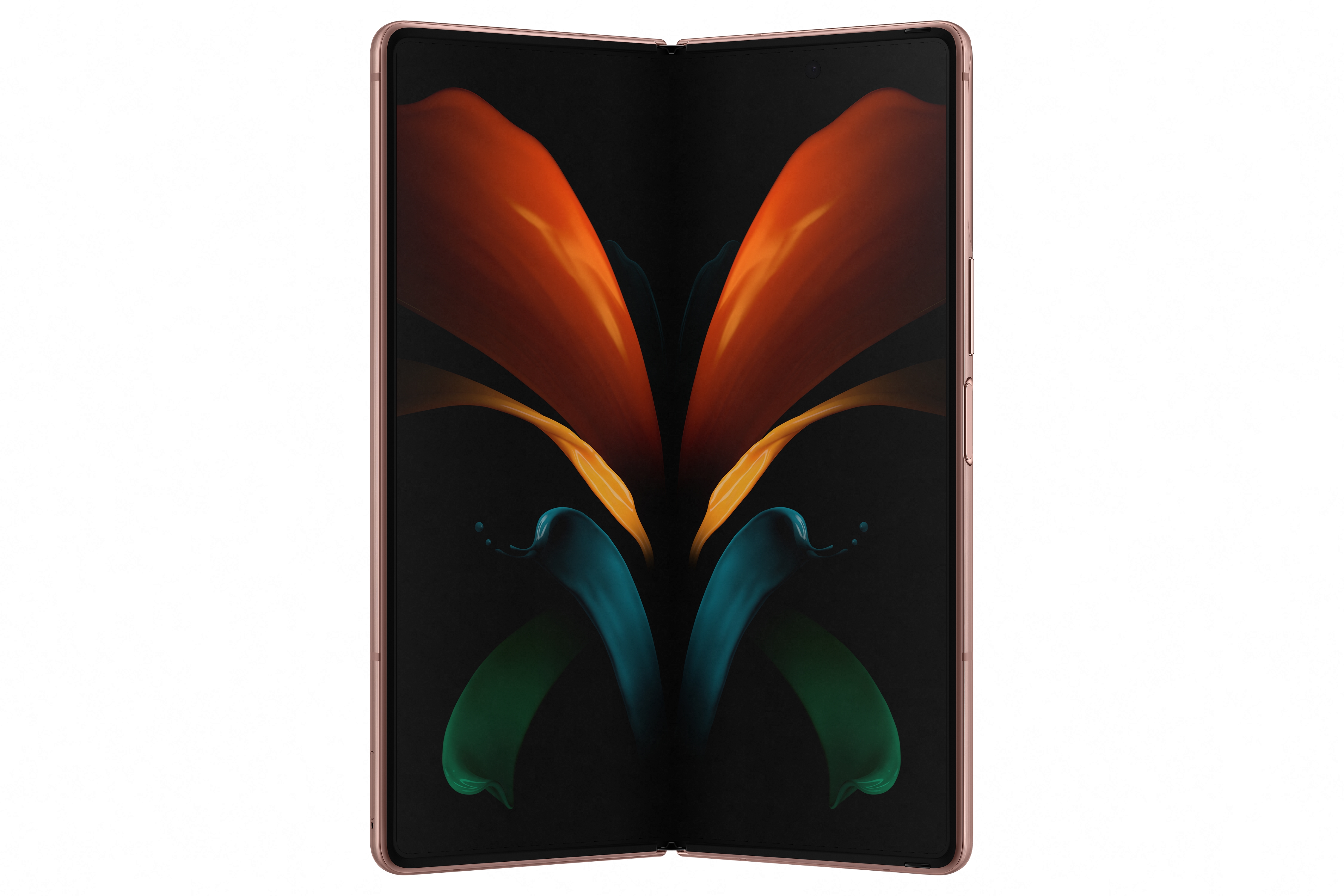
Noting down the upgrades of the primary display will require two whole screens. For starters, it goes to the very edges of the phone, thanks to slimmer and equal bezels on all four sides. Since they do protrude upwards, swiping can be a hit or miss. The big notch has been replaced by a tiny punch-hole for the selfie camera. Spanning 7.8-inches diagonally in a 4:5 aspect ratio, it’s almost like having two 6.5-inch displays together. If you’ve used any modern phone whose display is in the whereabouts (you probably already have), then we don’t need to tell you how big two of those seem like. Samsung even took the refresh rate up by a notch to 120Hz, which is very noticeable on a larger screen.
On the topic of things that are noticeable, the Samsung Galaxy Z Fold 2 continues to sport the infamous crease that is always present. It’s less prominent this time, but you will notice the added reflections at many angles. Though, when the display is on, things get a lot better and easier to overlook. Think of the crease as the notch that smartphones circa 2018 had - easy to ignore but obtrusive every now and then.
The last change will be a little difficult to appreciate unless you're coming from the original Fold. The new UTG display and the screen protector atop will feel flimsy and half-baked when compared to any other phone with a real glass display. That’s just an unavoidable evil that early adopters will have to live with, till we develop ways to successfully fold glass without breaking it. If I were to explain the feeling of pressing against it, it’s like trying to use a touchscreen that has a couple layers of tape on top. The responsiveness is fine, but the fact that it moves a little each time it’s pressed can seem worrisome.
Samsung’s pedigree in displays is well-known, and we get the same excellent stuff here once again. Great punchy colours, inky blacks, ample brightness and enjoyable responsiveness.
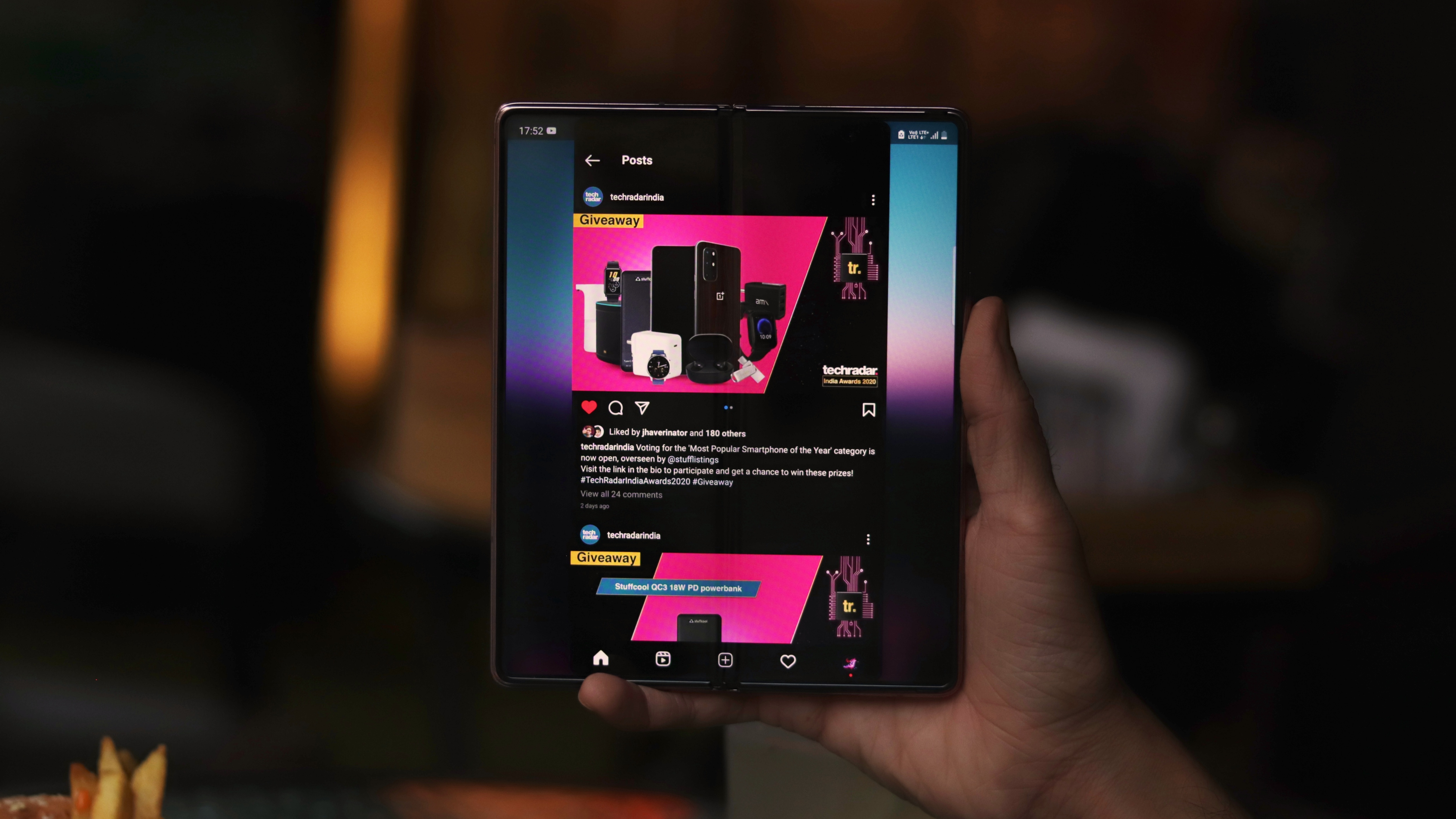
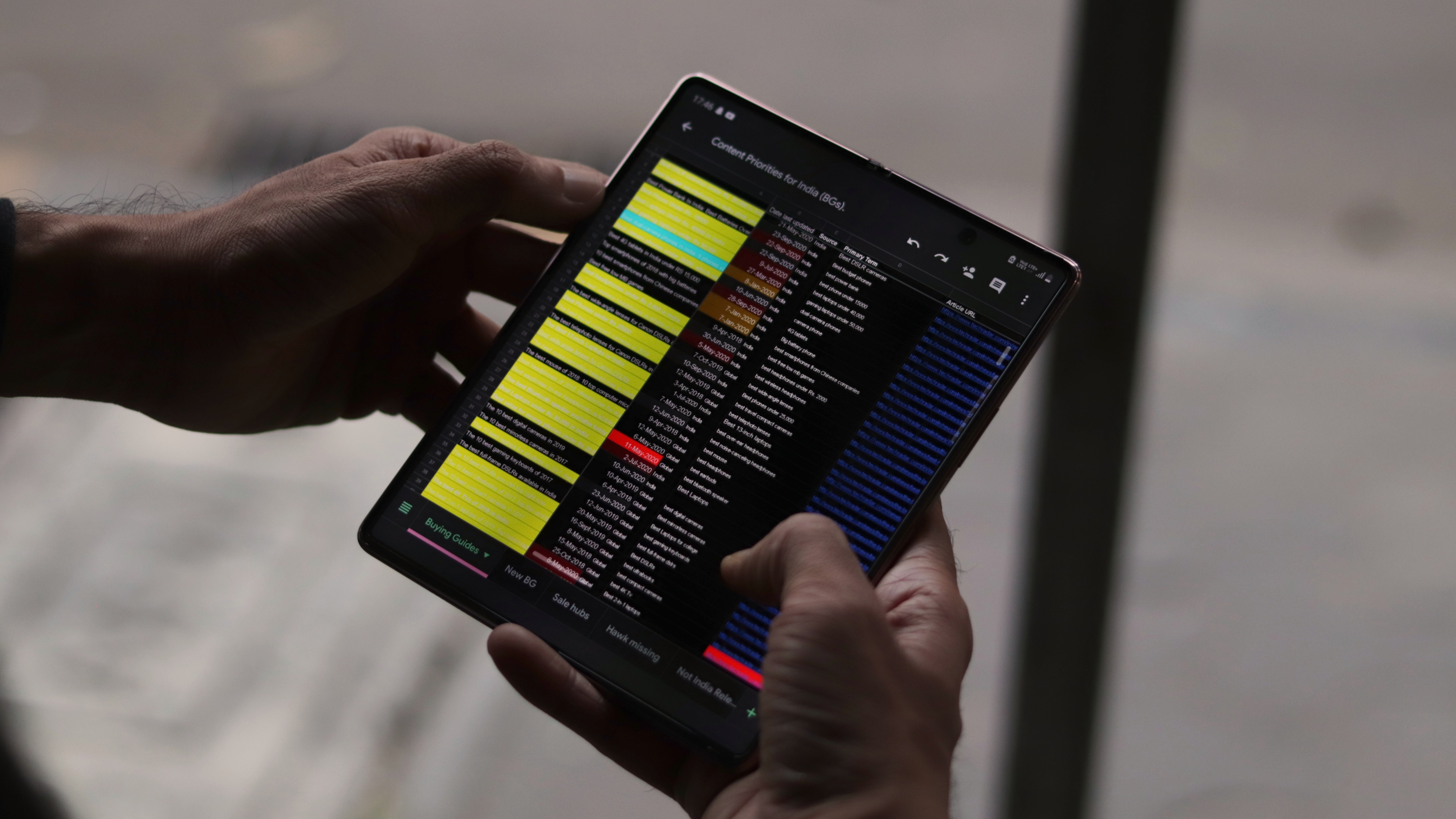
For any foldable, the closer one display gets to a conventional screen aspect ratio, the farther the other display will get from it.
There’s a bit of a mental learning curve that will come when you start using a foldable: deciding when to opt for the bigger screen and when to settle for the smaller one. Samsung has done a great job at ensuring that most apps work fine on both displays, but some programs will fail to scale correctly. There’s really no direct workaround for this as one display is extremely tall and the other is much wider than the usual 16:9 that content is designed for.
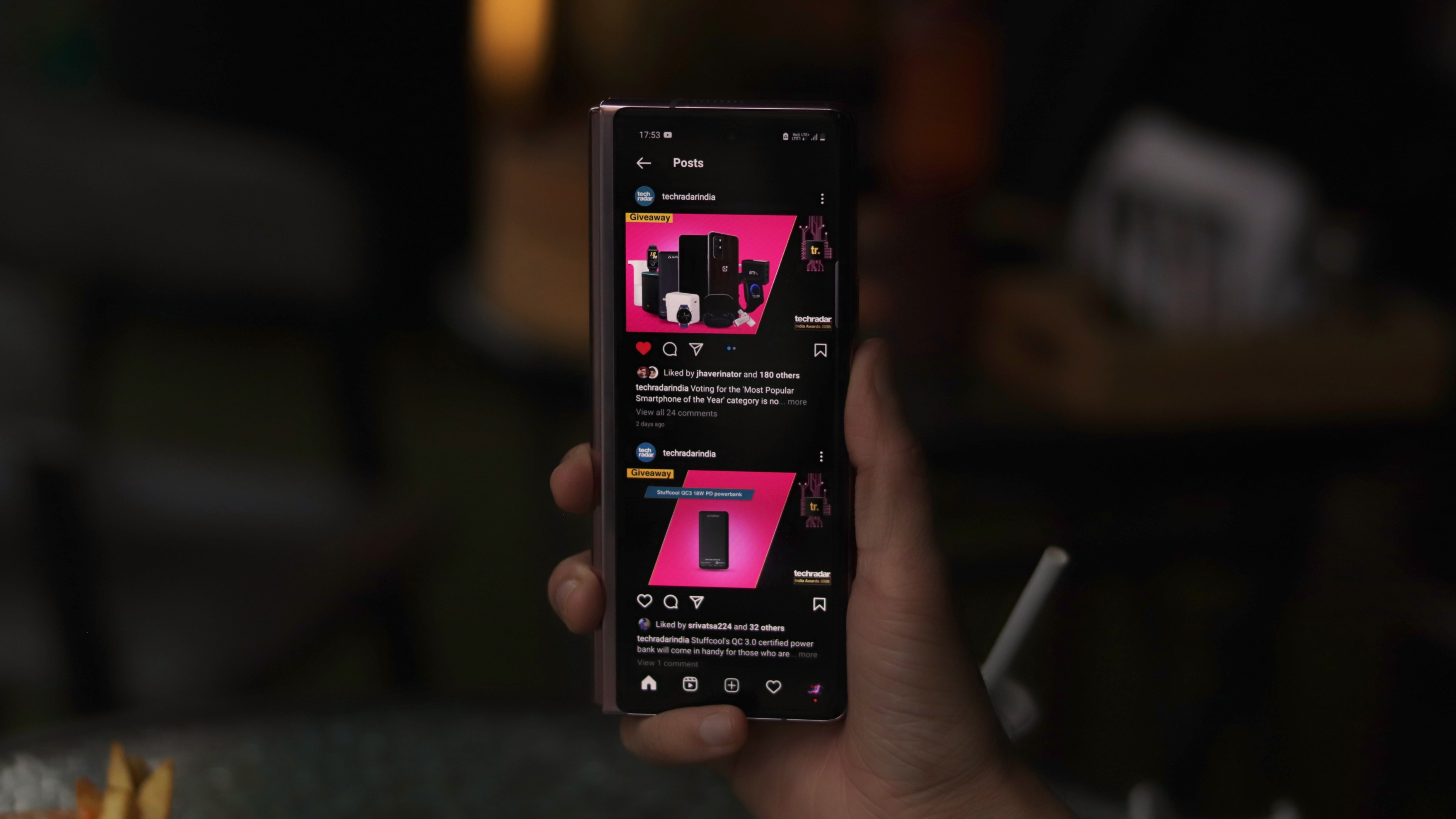
I will go out on a limb and say that most apps work really well at using the extra real estate on either of the axes to show more content, and the problem has been blown out of proportion by talking about Instagram, which is an app that works well only on iPhones. And when you think about it, Instagram can’t really help it as the nature of its content is really not meant for tablets — Imagine not being able to view an entire post at once! The windowed approach taken here is probably the only solution right now.
In fact, most other social media platforms benefit from this approach. Since most content’s size is limited by the width of the display and not the height, having almost double the horizontal real estate actually enables an almost 4x bigger viewing experience! Videos on Facebook is perhaps the best example of this. Even tweets get equally larger. As a person that has gotten used to wearing glasses while using my phone, the Z Fold 2 served me well as a bed-time reading machine.
The benefits of a bigger display are also rather understated. We’ve become so accustomed to adjusting to what our phones can offer that we’re forgetting how good things can be. When was the last time you opened a document, decided to zoom in only to find out that you went too far and didn’t have to zoom out just the right amount to be able to get more content on the screen? For a simple task, that’s quite some compromise on the experience front. Even web pages look a lot better on a wider screen, pushing the ads to the sides and giving users some space to rest their fingers or scroll without covering the contents.
There’s a reason why smartphone displays have constantly gotten bigger over the last decade. With foldables, OEMs can continue offering a better viewing experience without constant bulk on all dimensions. A bigger display also makes for more confident usage, be it checking out an Excel sheet or accessing a CMS. I don’t need to elaborate on how dreadful these tasks are on regular smartphones.
Like these wallpapers? Check out Elora Pautrat's website for more!
Software
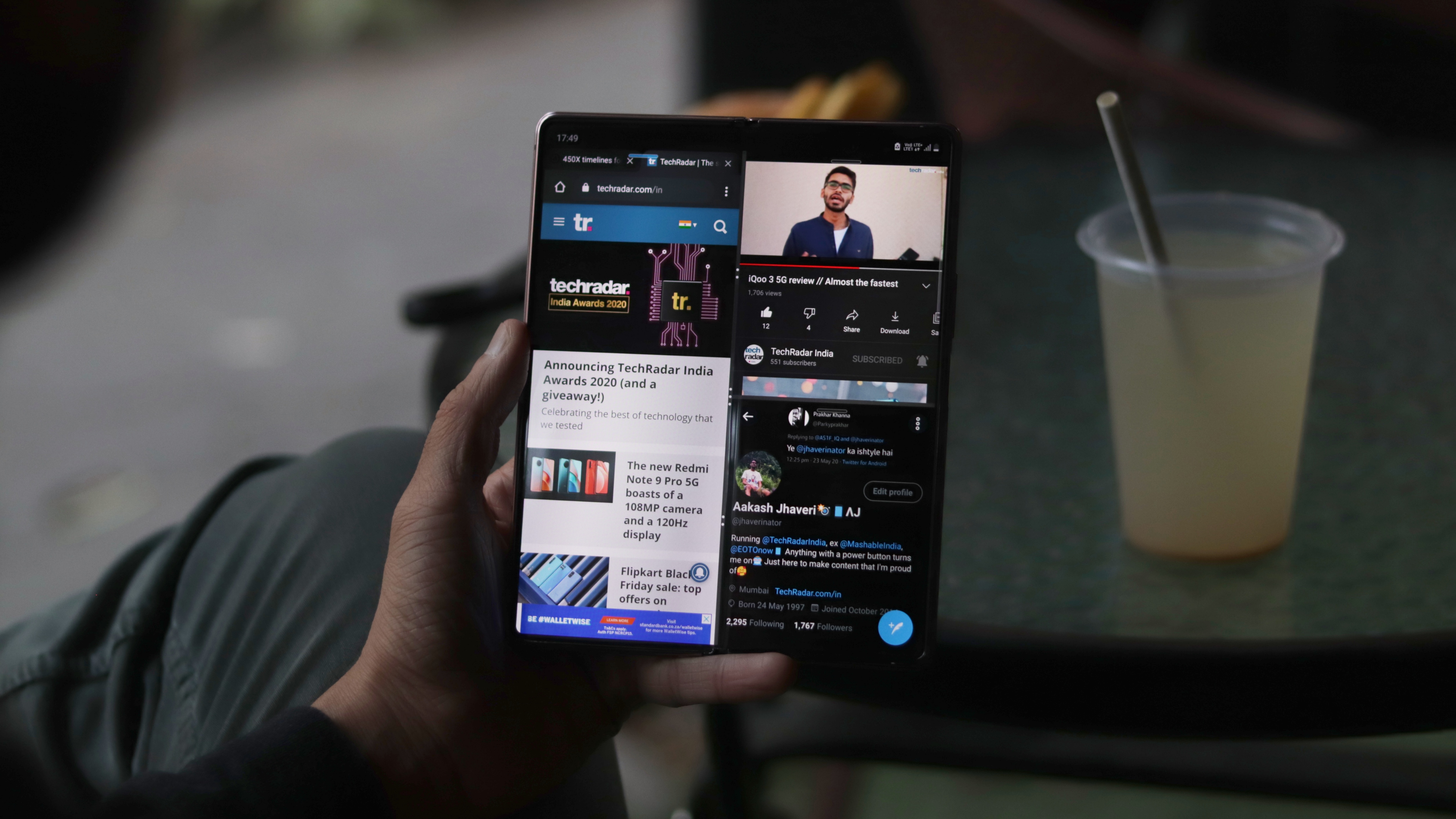
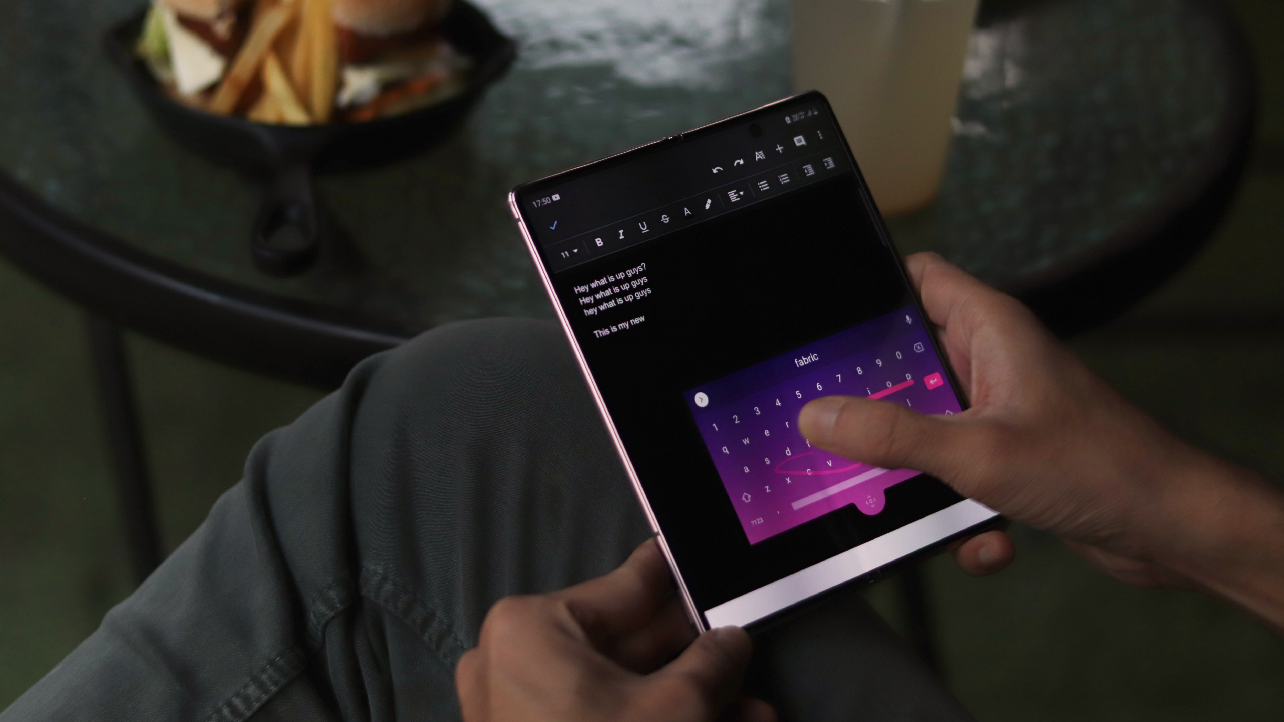
While a bigger display opens up a barrage of possibilities, all of that is redundant without the right interface to make the most of it. Since foldables are still in a phase of infancy, almost every specific software scenario on the Z Fold 2 has been developed by Samsung and not baked into Android by Google. Thankfully, the most important apps and combinations are already taken care of. Unfortunately, since this is non-native behaviour for Android, you'll run into a fair share of hiccups along the way.
Let’s start with the good stuff and things that actually work well. Flex Mode, in its new avatar, is something we expect every future foldable to imitate. Samsung’s split-screen implementation works really well at separating the viewing areas from the interacting areas, giving an unobstructed viewing experience as well as a larger input area.
Apps where Flex mode really shines include YouTube, the camera and gallery. I was also pleasantly surprised at how short the learning curve was for an entirely new sort of dynamic interface. The content adapts to inputs just as you’d expect.
YouTube for instance, can seamlessly be continued from the outer screen to inner by simply unfolding. Further, you can choose between a complete full screen view, a semi-full screen (similar to YouTube on desktop) or even a special flex mode where the top half will continue showing the video while the bottom can be used for scrubbing, browsing or comments. A similar implementation is seen in the stock gallery app where the bottom half can be used to scroll through content without obstructing the view.
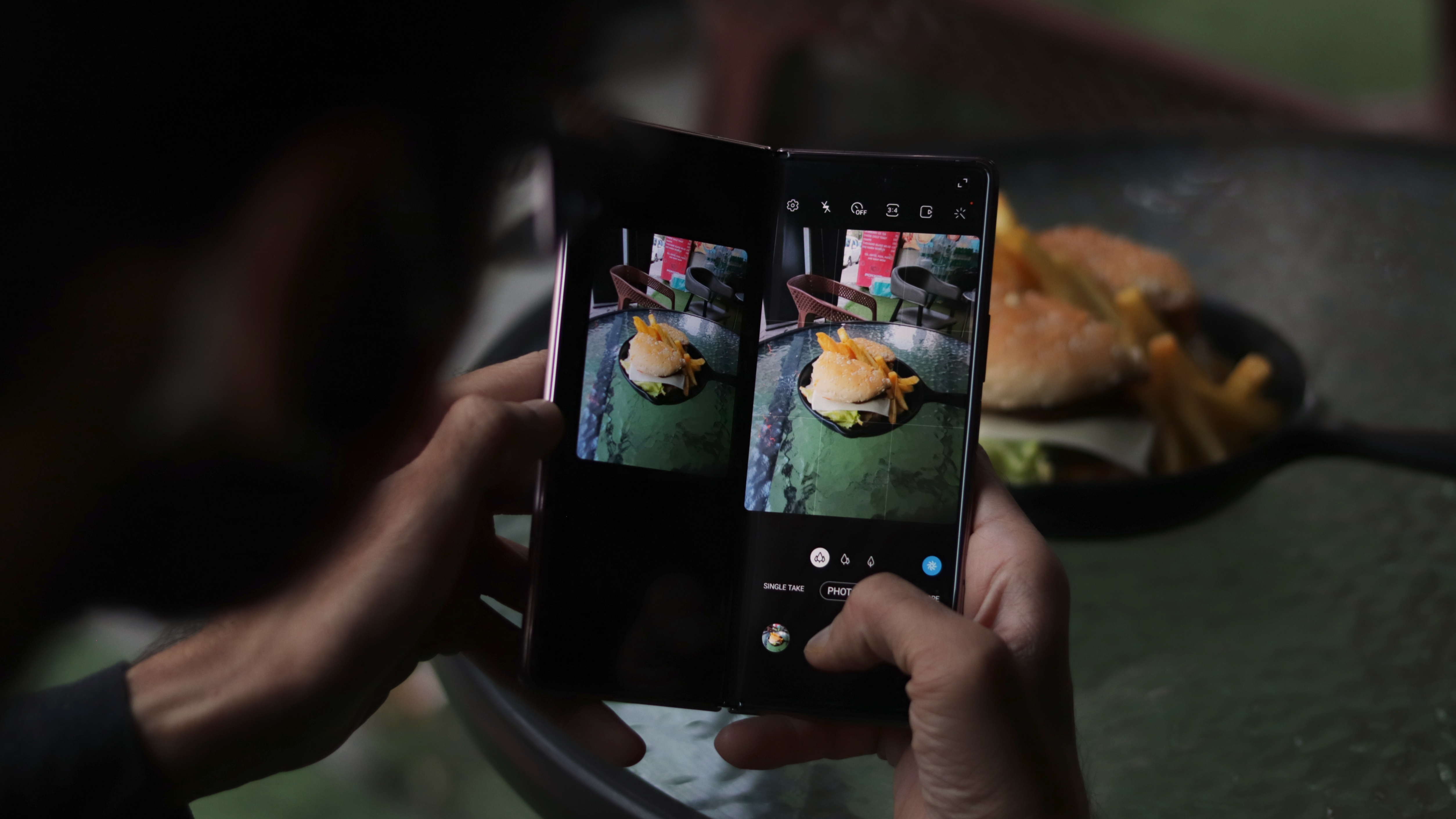
The camera app takes things further by giving us the ability to use all the screens at once. When folded, the cover display can be used as a normal viewfinder. When opened, it offers a giant viewfinder to better compose shots and check for focus. Since all sensors shoot in 4:3 inherently, this allows for a very expansive monitoring system, albeit slightly inaccurate. If you’re big on perfection, the primary display can be folded a little bit to show the last shot for reference while the other half acts as the usual viewfinder. Lastly, since there are displays on both sides, the primary array of cameras can also be used for selfies. It is a little uncomfortable (and thus, risky), but that’s the coolest party trick you can pull off.
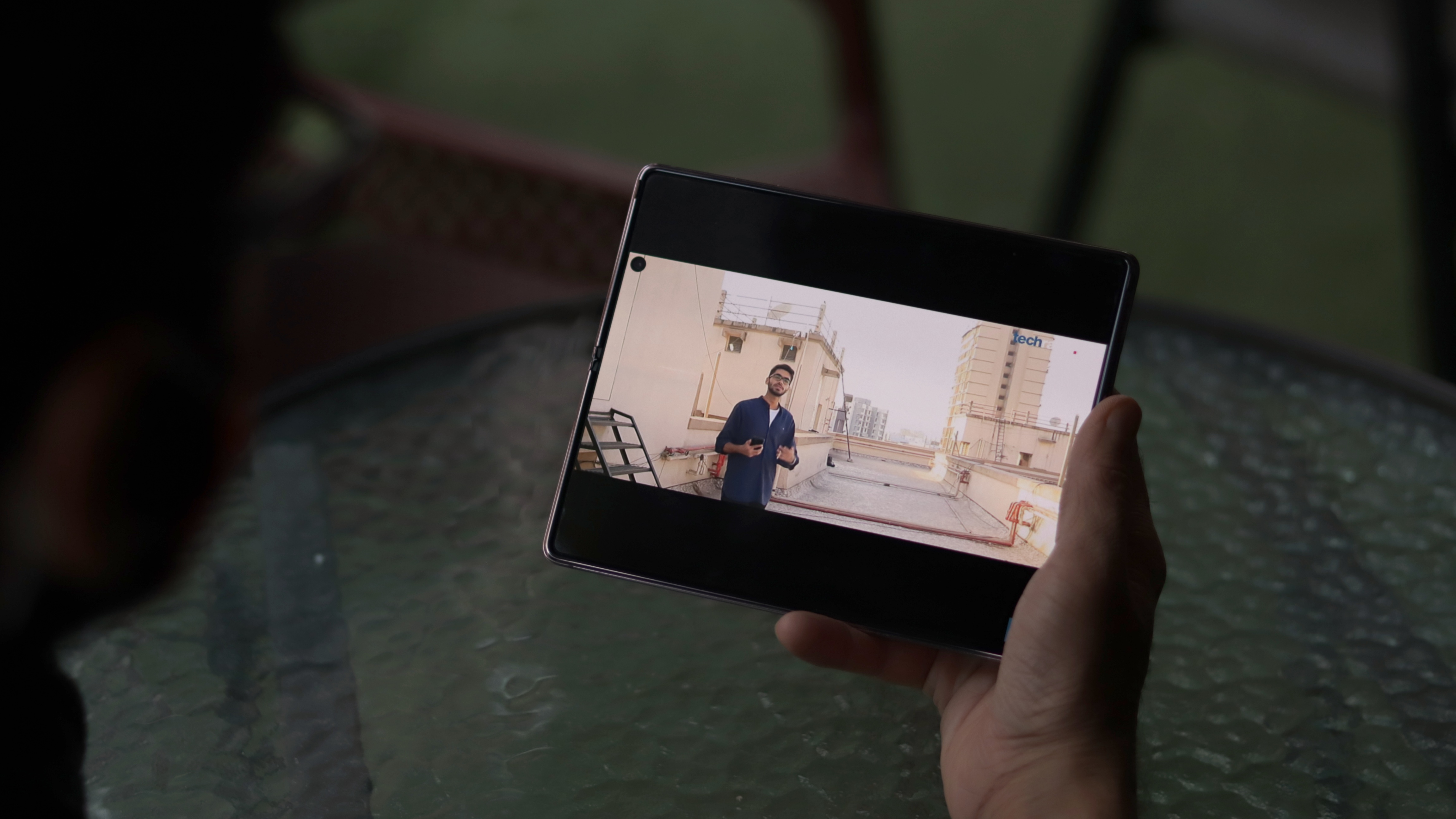
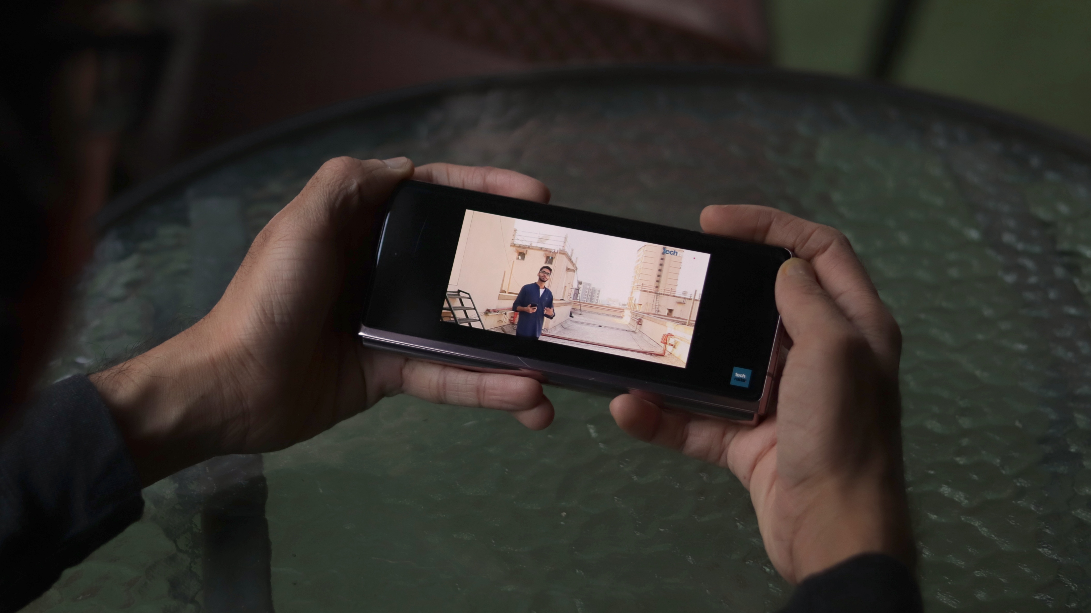
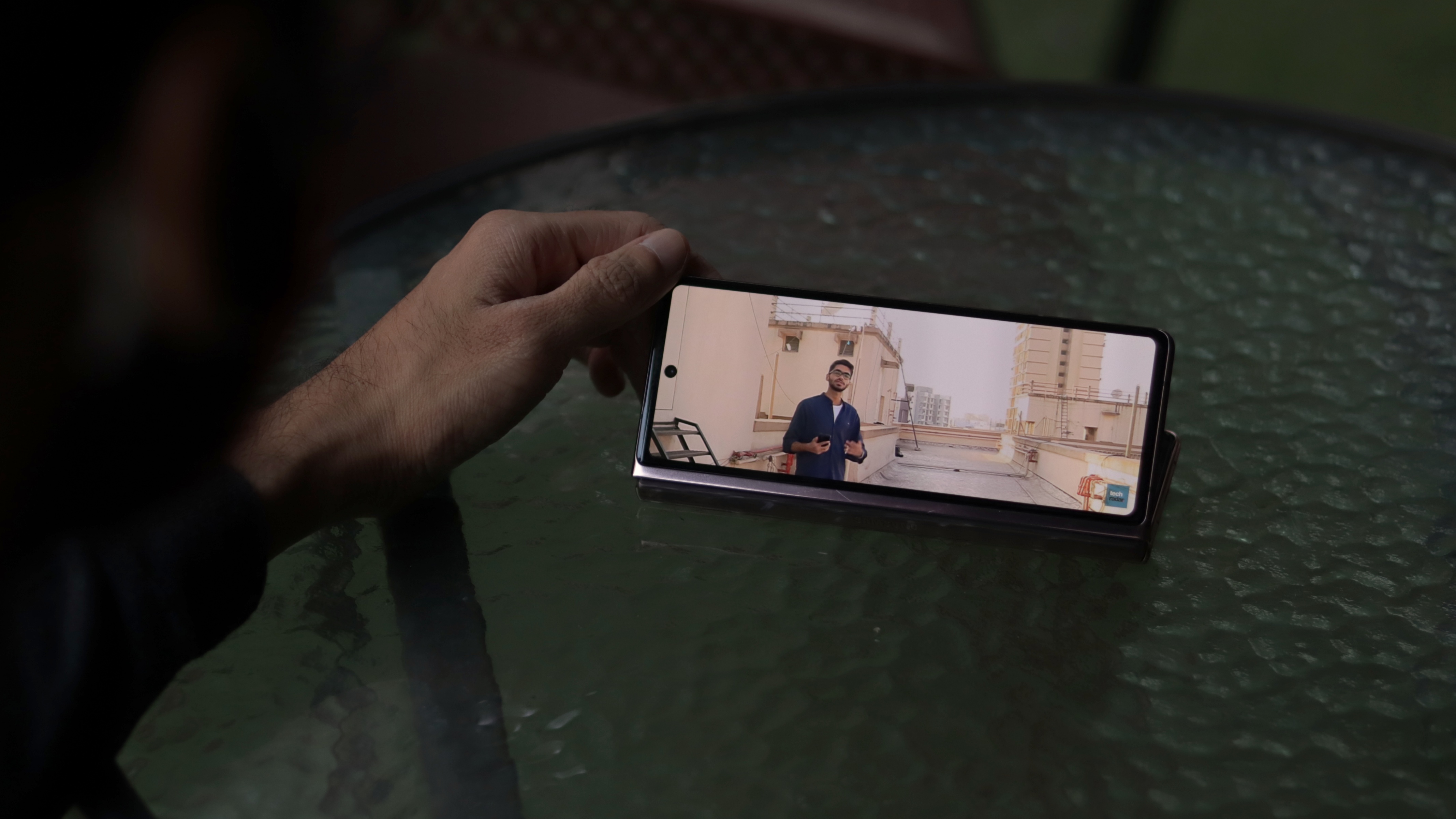
Samsung’s partnership with Microsoft also allows for easy content shifting from one Office app to another with a very natural pick and drop gesture. We’d love to see more apps support this functionality, especially the Google Suite. Google Duo also supports Flex Mode so you can prop it up for video calls just like a laptop.
For every other app, you get the new One UI experience which allows for three apps to be opened simultaneously on the Samsung Galaxy Z Fold 2 - one full screen and two halves. It’s also easier than Android’s split-screen interface as One UI offers a quick app launch shortcut on the right edge. Over here, along with the option to open literally any app, you can also add combinations created for easy launching. My favourite trio was YouTube + Twitter + Chrome.
Another pleasant discovery was the fact that many games scaled well to reveal more content - horizontally on the cover display and vertically on the flexible display. Pokemon Go, PUBG Mobile, Beach Buggy Racing and a few other titles worked well on both screens.
Though, all is not rosy when it comes to the app continuity. Some apps have to be restarted when moving between screens while others refresh, leading us to lose the content we were watching. Even the home screen customizations had to be done separately for both the screens, almost as if we’re setting up two different phones. Some help with the theming and icons would have saved a lot of time.
On one hand, it’s commendable how well half of these actions work with almost no support from Google or developers. On the other hand, the limitations would often become irritants. With a lot more foldables expected in 2021, we are optimistic that the scenario will be much better with the Z Fold 3.
Performance
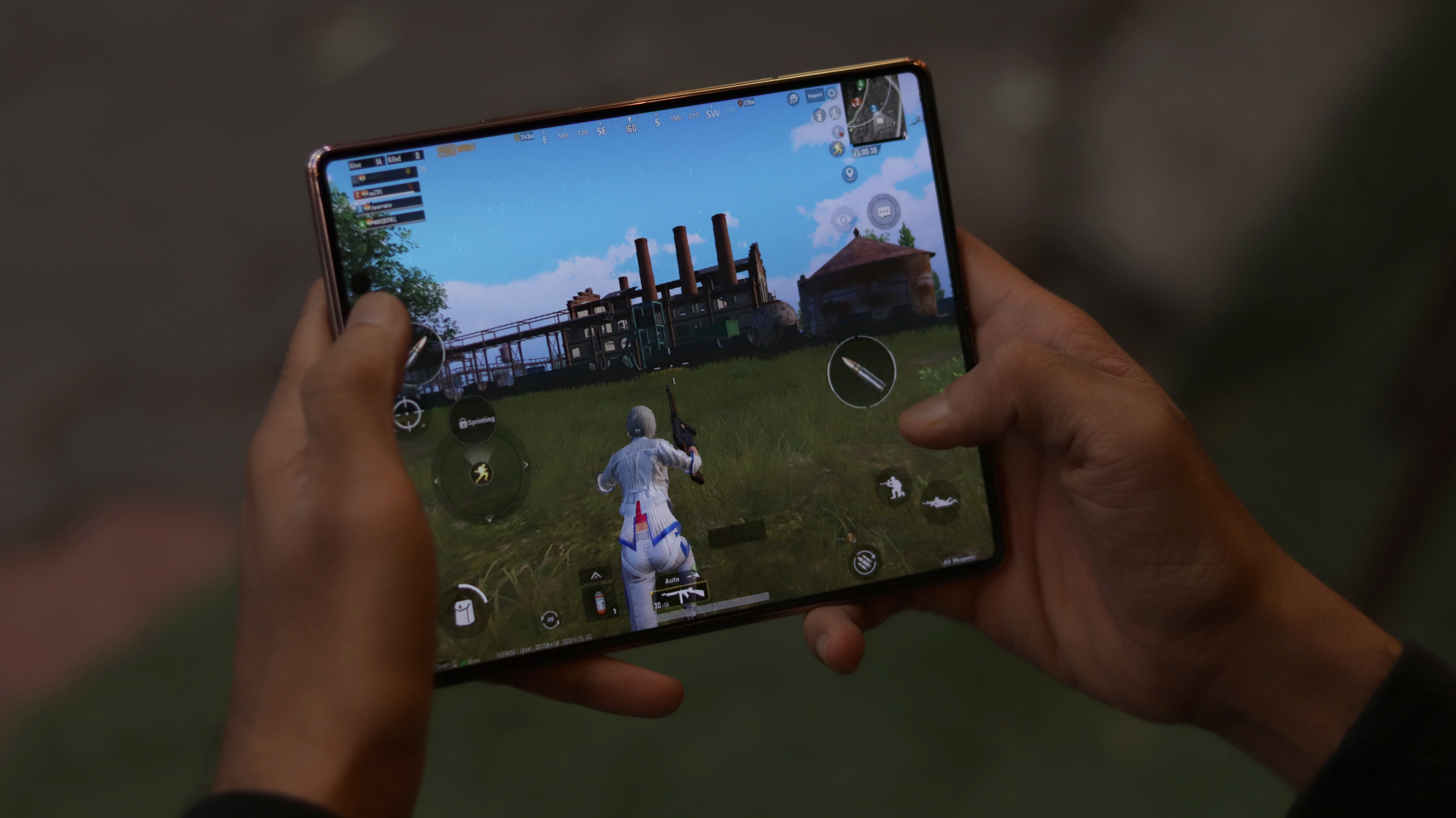
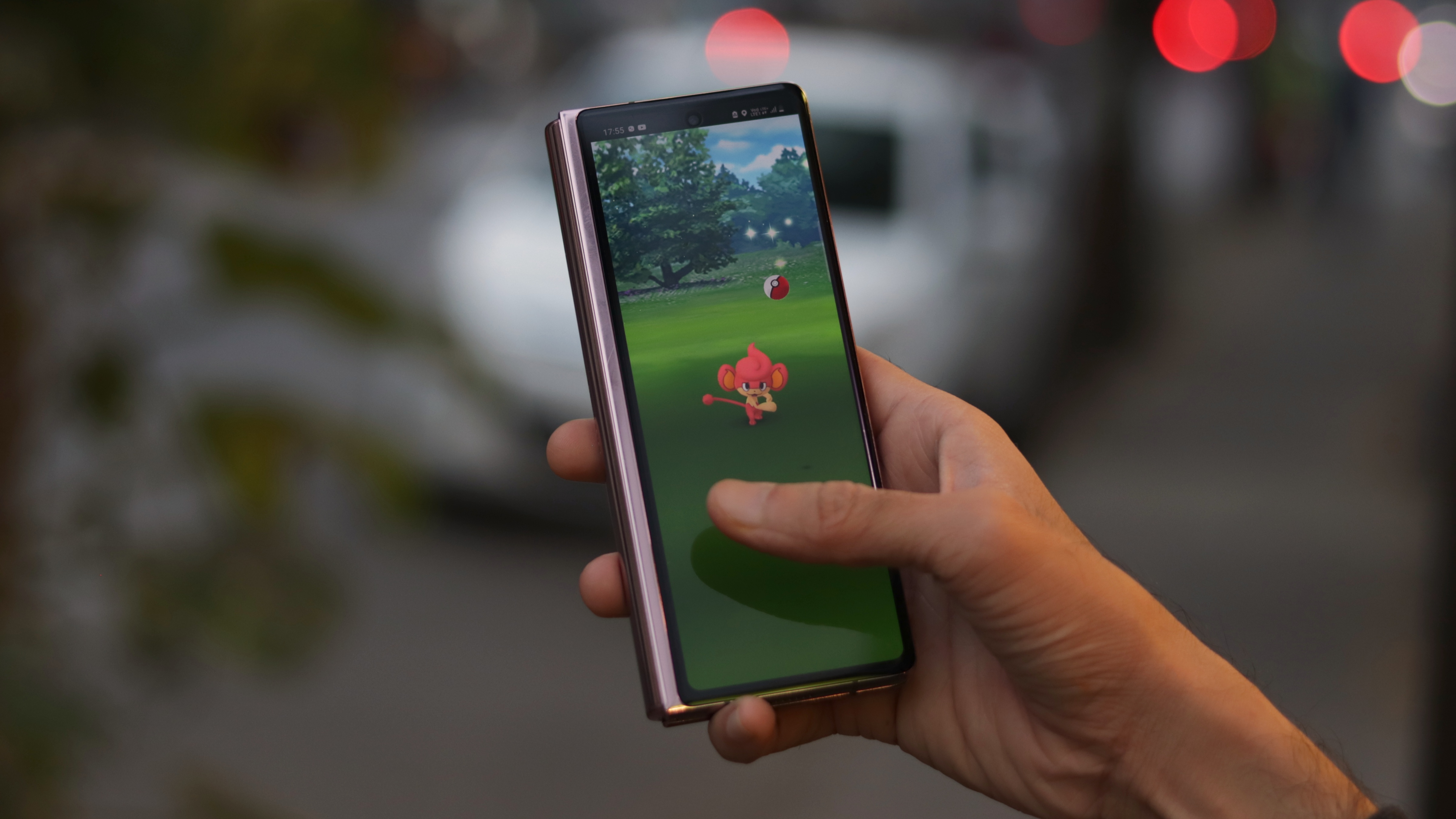
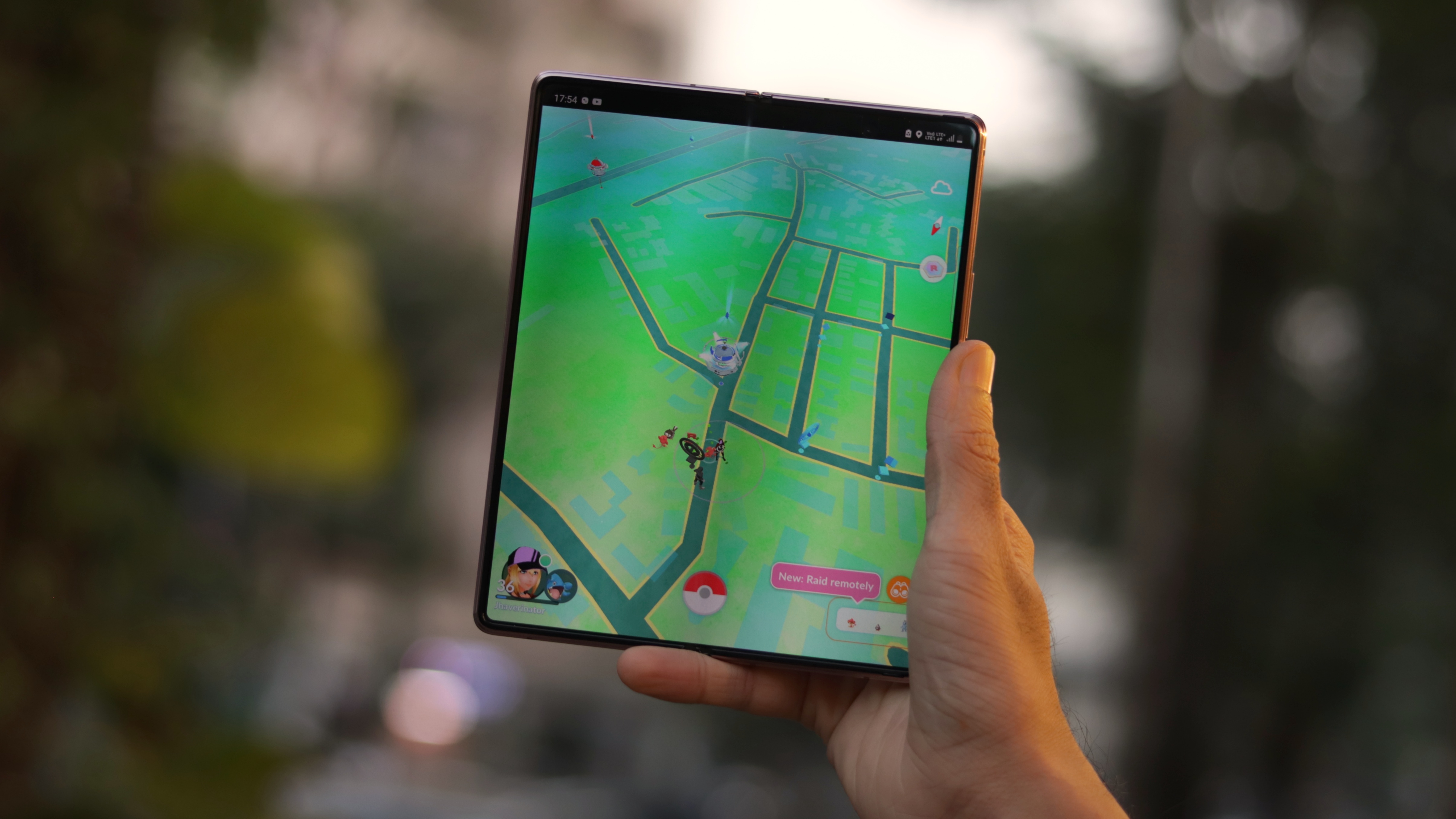
Another big win for Samsung comes with the performance, as the Z Fold 2 is the only high-end flagship to sport a Qualcomm chipset, in the form of the Snapdragon 865. We’re glad to see the omission of Exynos silicon here, which would have marred the experience and perhaps struggled with keeping up with so many complex tasks at once. In short, you won’t find much to complain about here, be it gaming or multi-tasking. We wonder how well Samsung's rumoured mid-range foldables will work...
Staying true to the theme of being futuristic, it also supports mmWave and Sub-6GHz 5G globally. Of course, this is currently a non-factor in India, but good to know that your expensive new phone will not be outdated in a few years.
The only real issue we had in this department was the 256GB of internal storage. While that will be sufficient for many users, the fact that there is no higher storage variant available or expandable storage could be an issue a few months down the road.
Battery
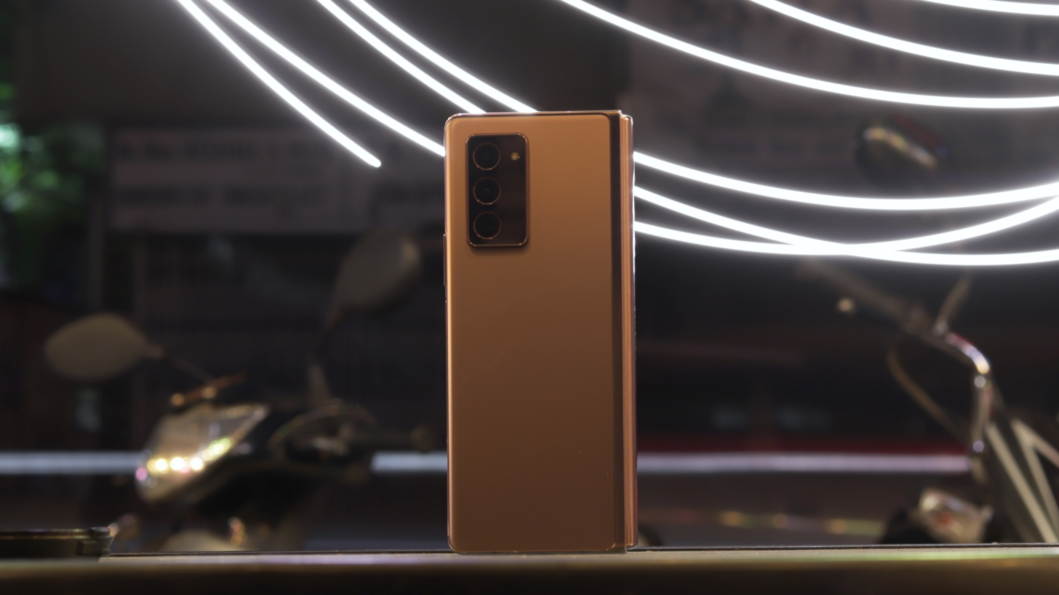
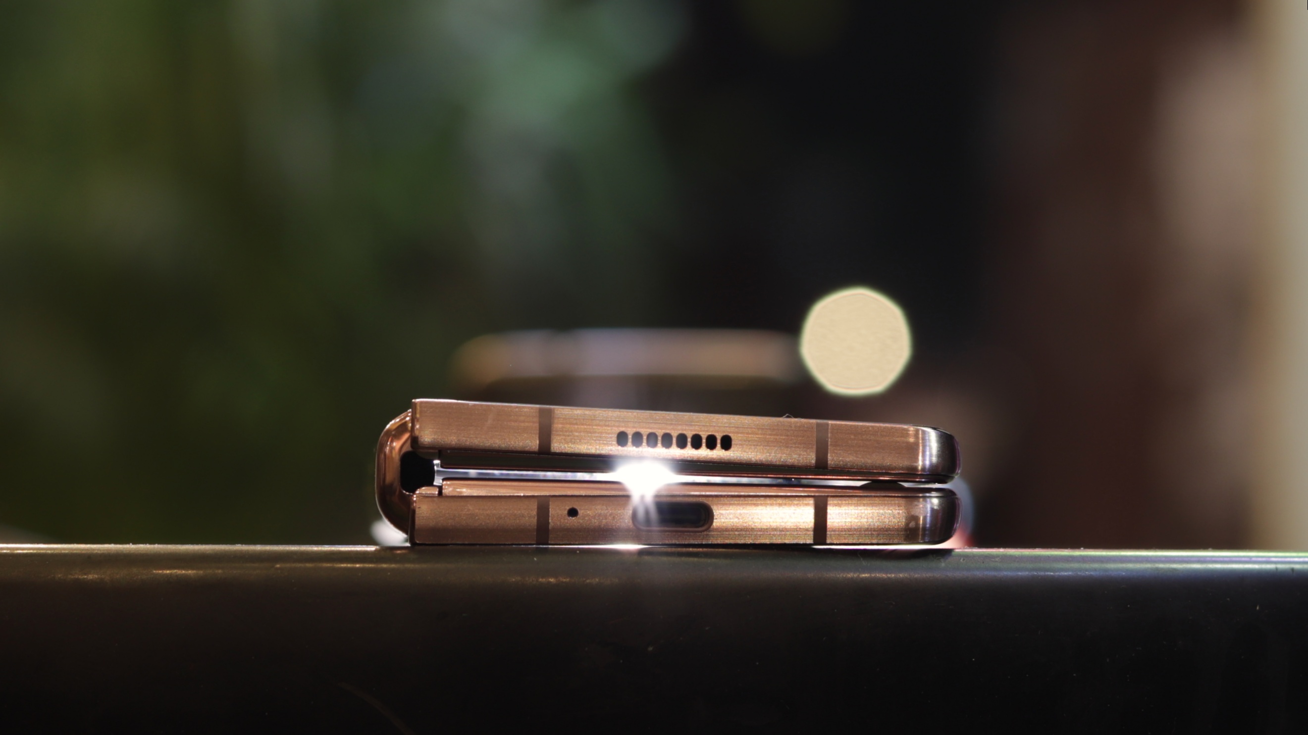
The Samsung Galaxy Z Fold 2 beat our expectations once again with its battery life. For a phone with an average-sized battery and an above average-sized 4,500mAh display, the odds were against it. Having used the Note 20 Ultra before it, which is a close cousin, our expectations were low.
Surprisingly, the phone lasted us through an entire day’s worth of heavy use on most days, while we went out of our way to use the bigger display more. We could achieve 5-6 hours of screen-on-time regularly. This is likely due to the inclusion of the Snapdragon 865 over the Exynos 990.
The 25W charger takes about an hour and a half for recharging, but using it slows down the refueling by quite a bit.
Camera
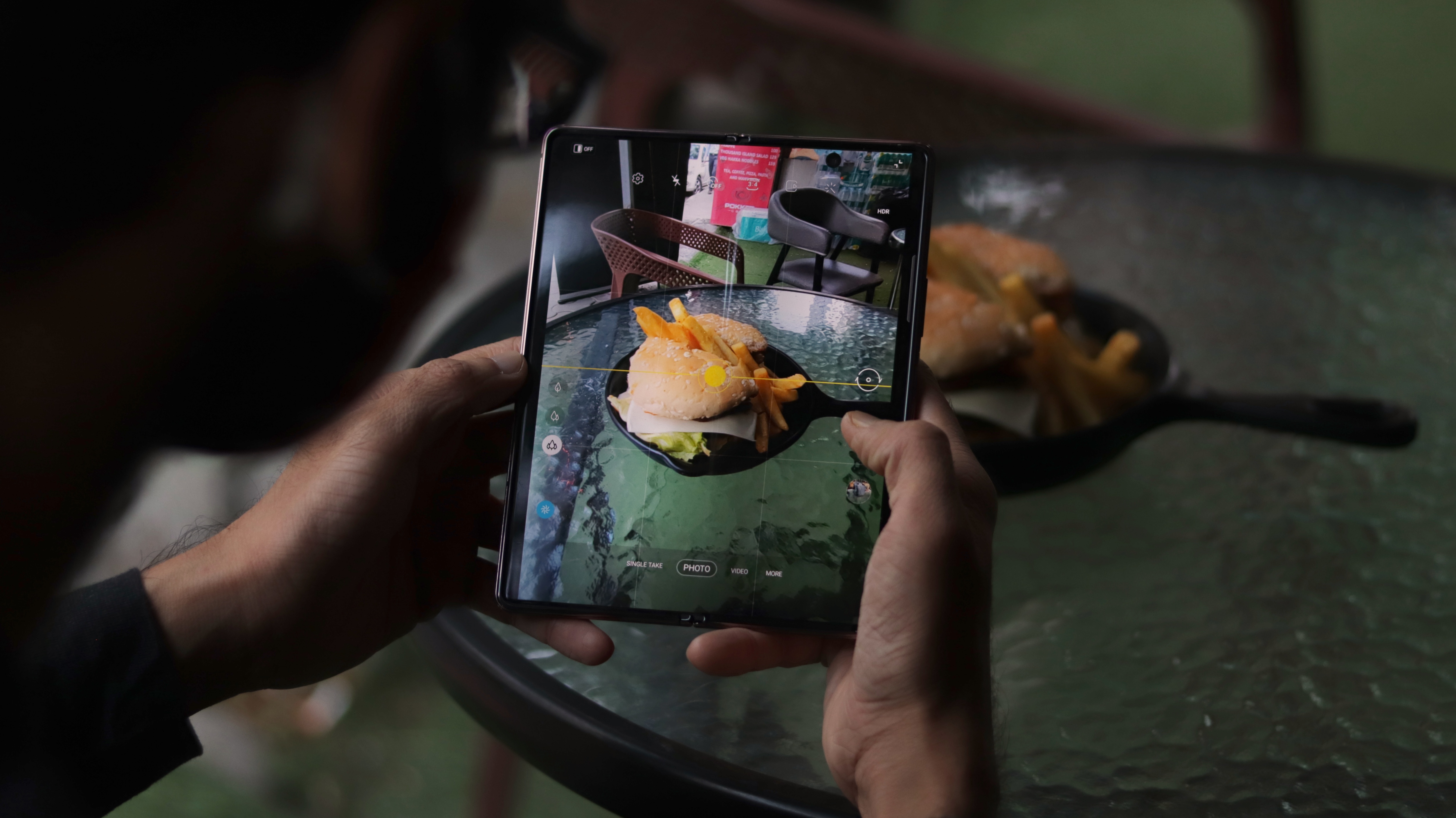
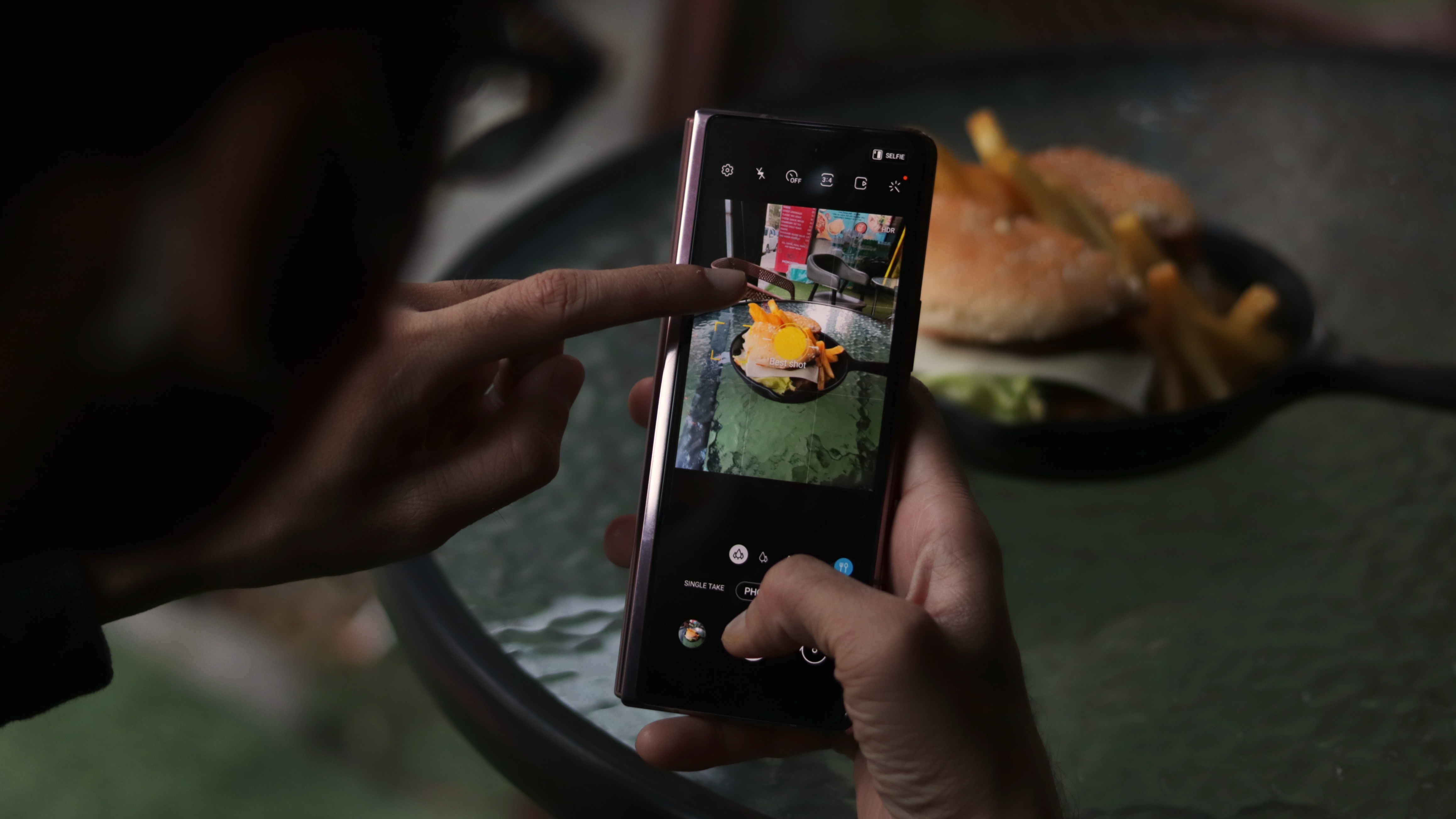
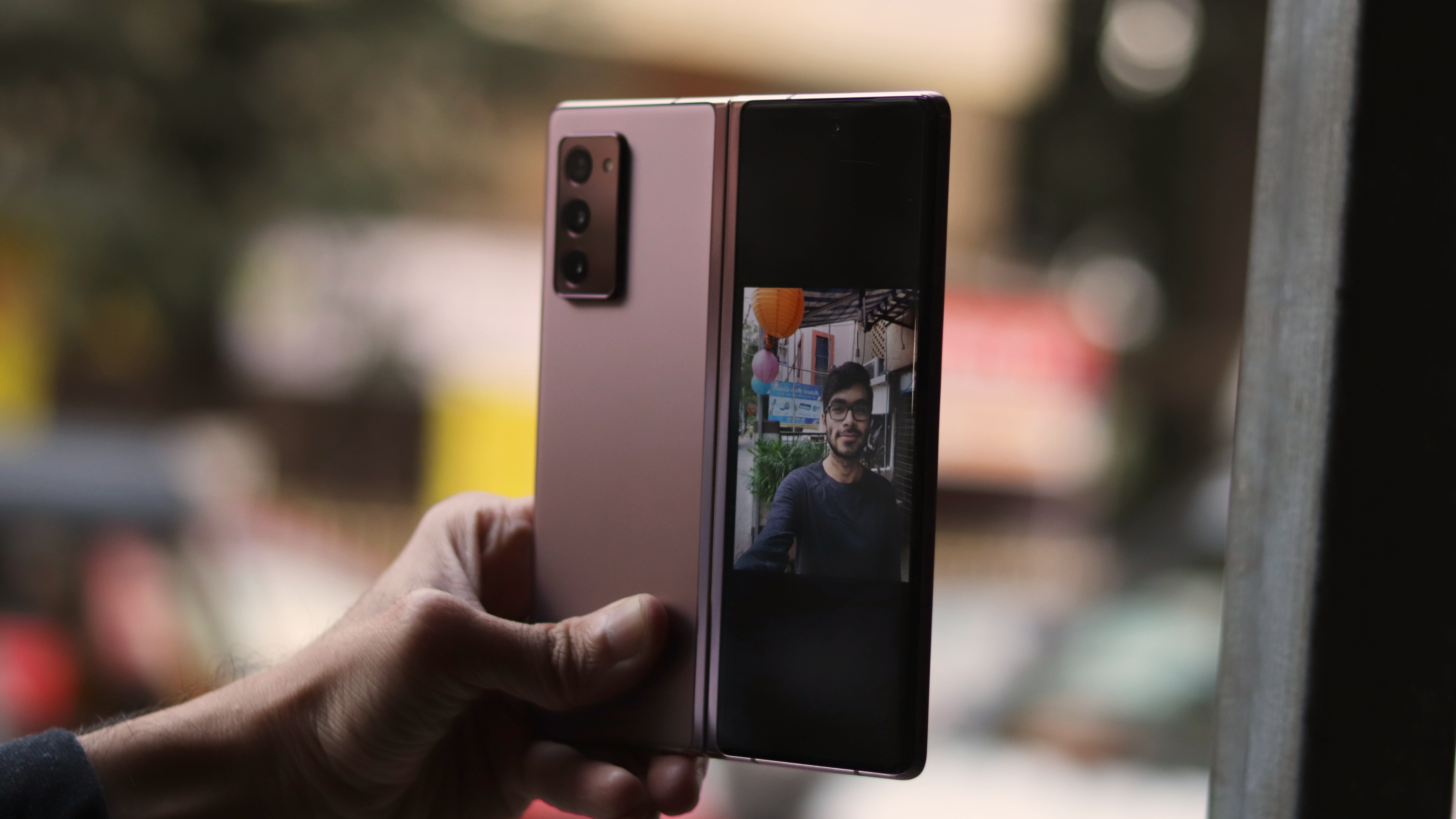
You shouldn’t get the Z Fold 2 for its cameras. If content creation is high on your preferences, most regular and cheaper phones will offer a better experience, with Samsung’s Note 20 Ultra being a great alternative in the same price range.

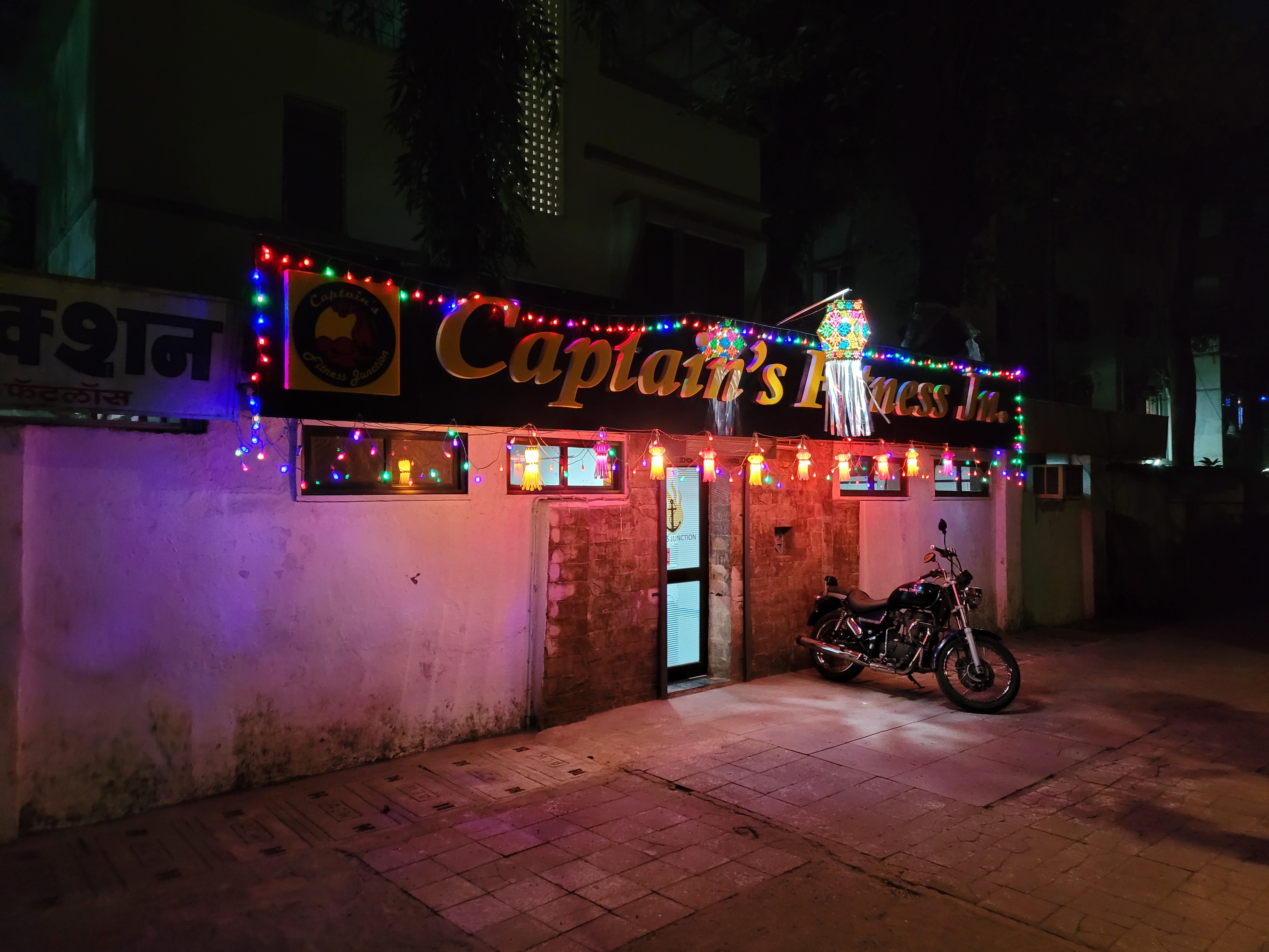
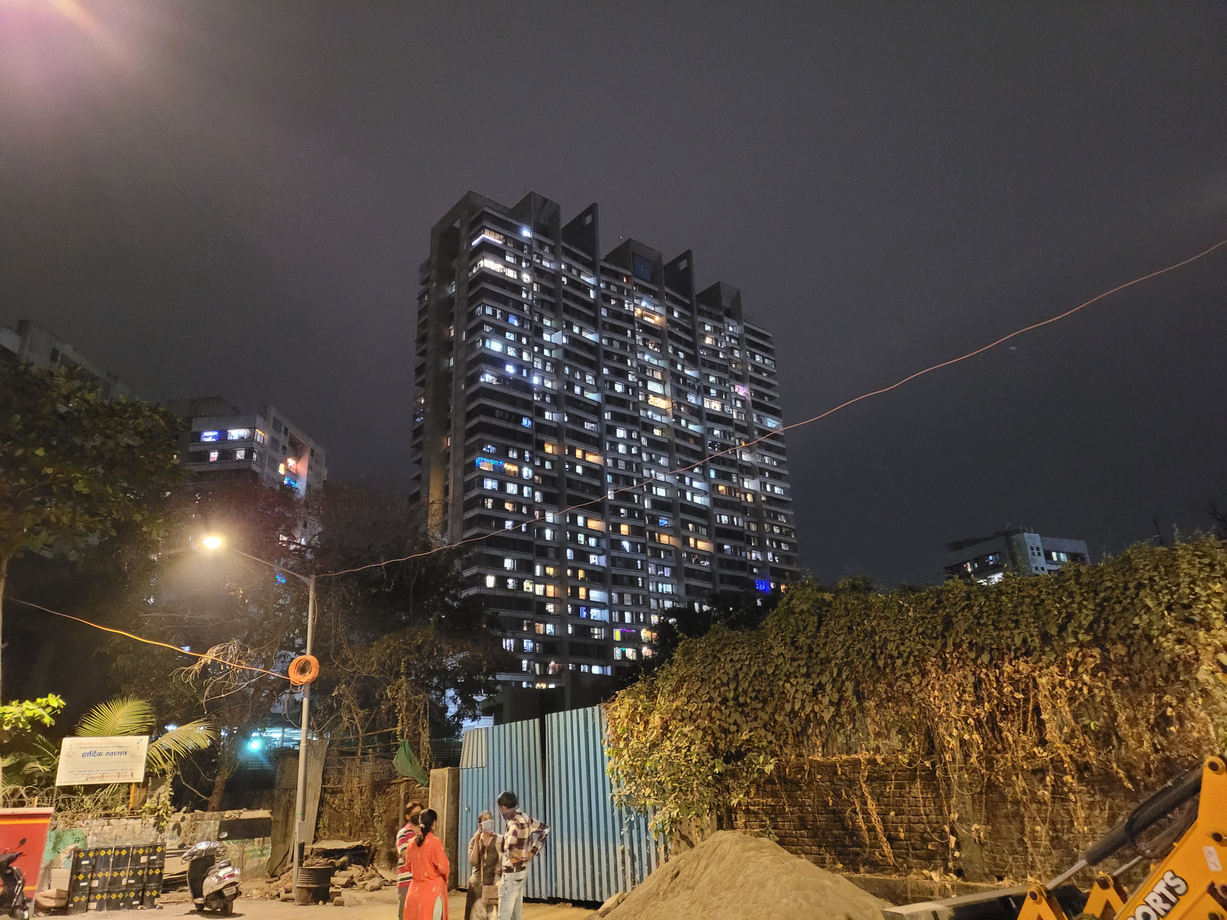
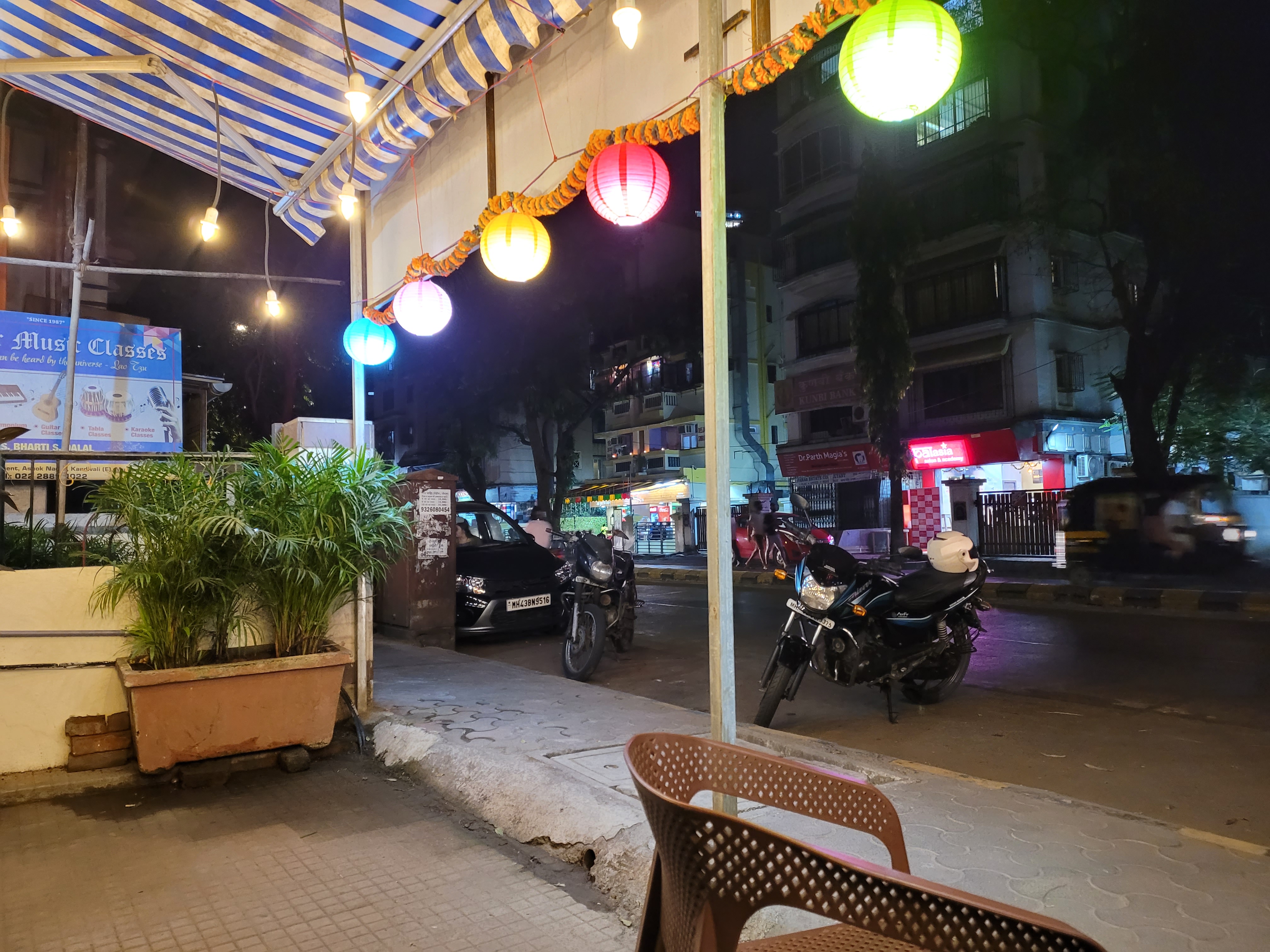


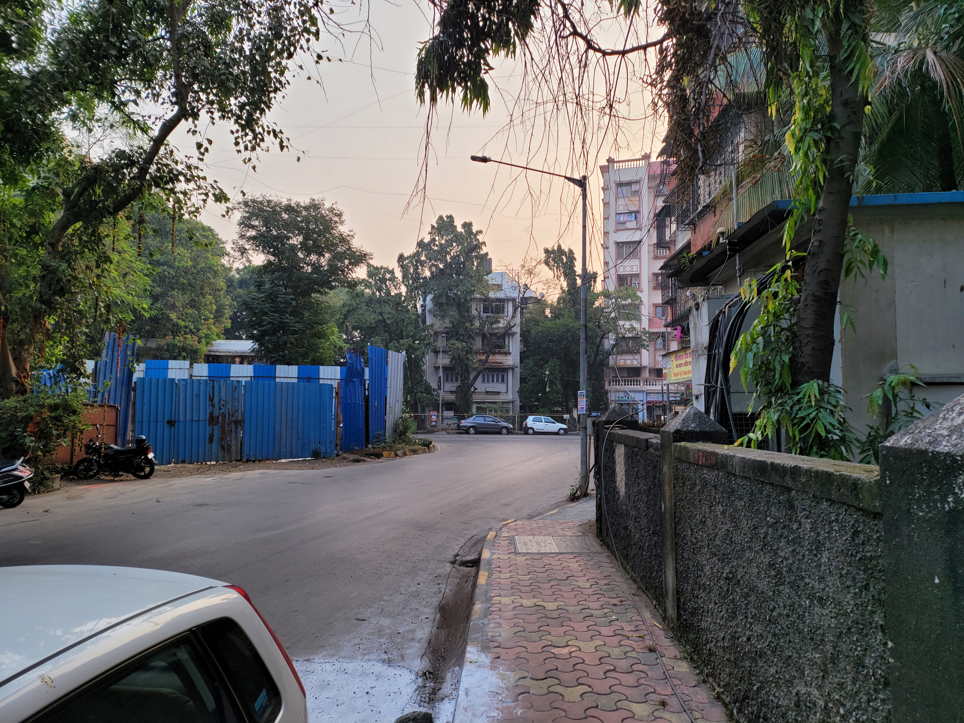

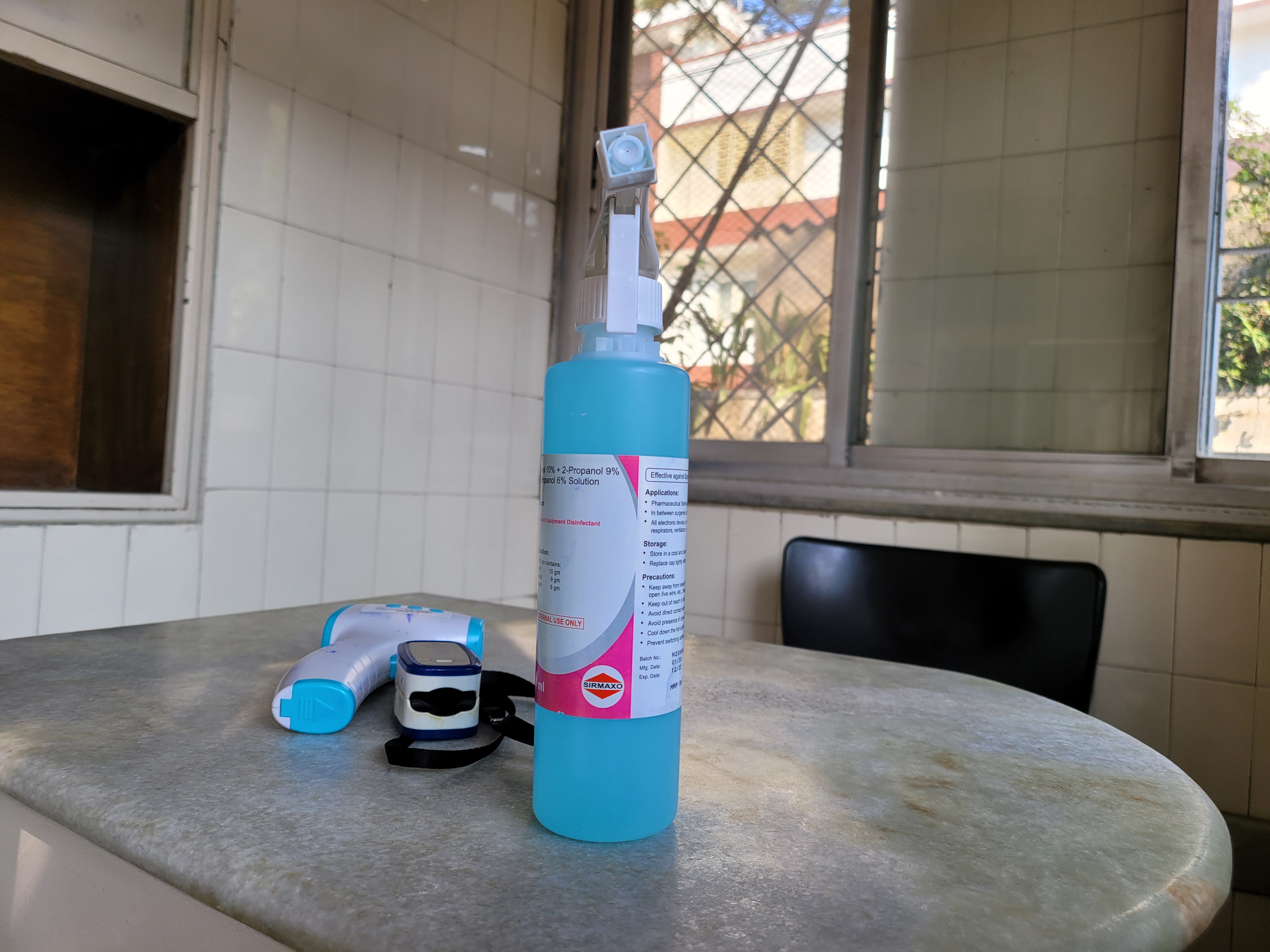
Having said that, they’re not bad by any means. Pictures from all three 12MP rear cameras (regular, ultrawide and telephoto), as well as the two 10MP cameras (one of the Cover Display and one on the inside tablet display) look sharp. They’re all great. While we would have loved to see a bigger sensor and longer zoom, it’s important to remember that the Z Fold 2 is just 6.9mm at its thickest and has a lot of additional components inside which conventional phones don’t have to make space for.
The interface is easy to navigate through while being feature-packed. Along with the usual slew of capabilities, the ability to use the secondary display to help the subject pose better is very cool. In short, it’s a great camera, especially if you’re not comparing it to the competition.
Verdict
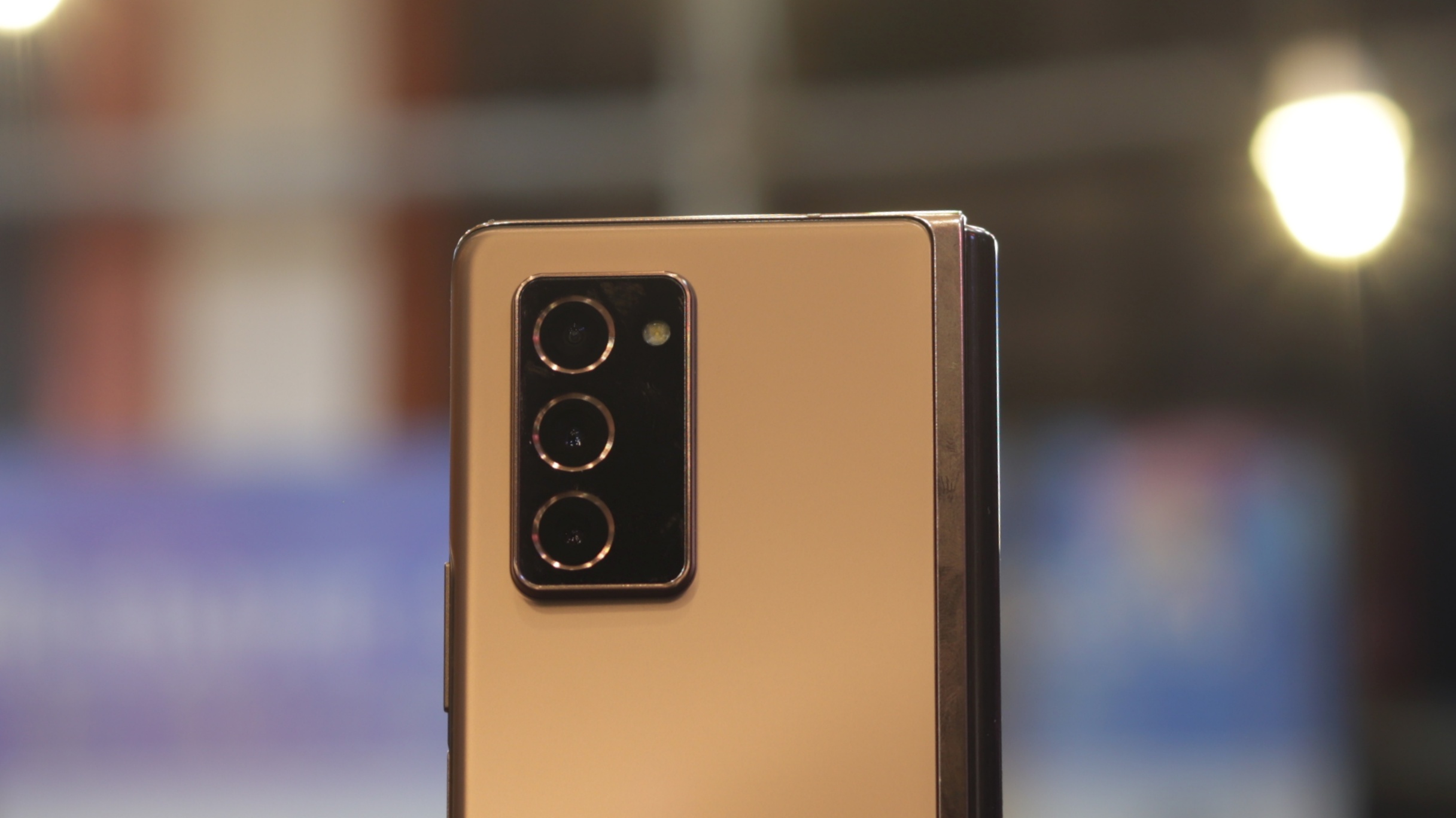
The Samsung Galaxy Z Fold 2 is not a normal phone, and thus reviewing it on the same parameters would be unjust. If you’re a part of the minority that is in the market for a foldable (and have no budget constraints), there’s no other device we can recommend as strongly. The answer remains the same if you’re looking for a phone that truly stands out.
If you’re looking for something a little more practical that won’t force you to adapt to its limitations, a high-end Android flagship will serve you well.
The Z Fold 2 is perhaps the biggest generational leap we’ve seen a smartphone series take this decade. Based on how the Z Fold 3 is shaping up, it looks like Samsung is going for the kill with a foldable that has far fewer compromises.
Buy it if...
You want to be the coolest kid on the block
There's no denying that the Samsung Galaxy Z Fold 2 is the world’s most cutting-edge foldable phone. Be it a meeting, a reunion or the commute, it turns heads like no other phone can.
You consume a lot of content
Viewing videos or reading on the Z Fold 2 is so enjoyable and comfortable that you might just start doing a lot more of that. The move to 120Hz makes it great for gaming too!
You're in the market for a foldable
Simply put, the Z Fold 2 is the only foldable that really justifies its price tag by becoming a tablet on demand, a feat which no other foldable can currently boast of.
Don't buy it if...
You can wait
Convinced by the concept of foldables but don't need to upgrade urgently? The Z Fold 3 is likley to address many of the issues that hold the Z Fold 2 back. Moreover, many others OEMs are also planning to releaase foldables in 2021, giving you more options to choose from.
You're not a careful user
With our phones following us everywhere, we often take for granted how durable they have become. The Z Fold 2, even with all its improvements, will be susceptible to the lightest of rain showers and the smallest of drops.
You need something that just works
Owing to the nascent nature of the space, some apps don't work well. If you think that an expensive phone should not come with multiple asterisks, consider getting any other flagship Android or even an iPhone.
Comments
Post a Comment